Using Themes to share colors and font styles
In order to share colors and font styles throughout our app, we can take
advantage of themes. There are two ways to define themes: App-wide or using
Theme Widgets that define the colors and font styles for a particular part of
our application. In fact, app-wide themes are just Theme Widgets created at
the root of our apps by the MaterialApp!
After we define a Theme, we can use it within our own Widgets. In addition, the Material Widgets provided by Flutter will use our Theme to set the background colors and and font styles for AppBars, Buttons, Checkboxes, and more.
Creating an app theme
In order to share a Theme containing colors and font styles across our entire
app, we can provide ThemeData
to the MaterialApp constructor.
If no theme is provided, Flutter will create a fallback theme under the hood.
new MaterialApp(
  title: title,
  theme: new ThemeData(
    brightness: Brightness.dark,
    primaryColor: Colors.lightBlue[800],
    accentColor: Colors.cyan[600],
  ),
);
Please see the ThemeData documentation to see all of the colors and fonts you can define.
Themes for part of an application
If we want to override the app-wide theme in part of our application, we can
wrap a section of our app in a Theme Widget.
There are two ways to approach this: creating unique ThemeData, or
extending the parent theme.
Creating unique ThemeData
If we don’t want to inherit any application colors or font styles, we can create
a new ThemeData() instance and pass that to the Theme Widget.
new Theme(
  // Create a unique theme with "new ThemeData"
  data: new ThemeData(
    accentColor: Colors.yellow,
  ),
  child: new FloatingActionButton(
    onPressed: () {},
    child: new Icon(Icons.add),
  ),
);
Extending the parent theme
Rather than overriding everything, it often makes sense to extend the parent
theme. We can achieve this by using the
copyWith
method.
new Theme(
  // Find and Extend the parent theme using "copyWith". Please see the next
  // section for more info on `Theme.of`.
  data: Theme.of(context).copyWith(accentColor: Colors.yellow),
  child: new FloatingActionButton(
    onPressed: null,
    child: new Icon(Icons.add),
  ),
);
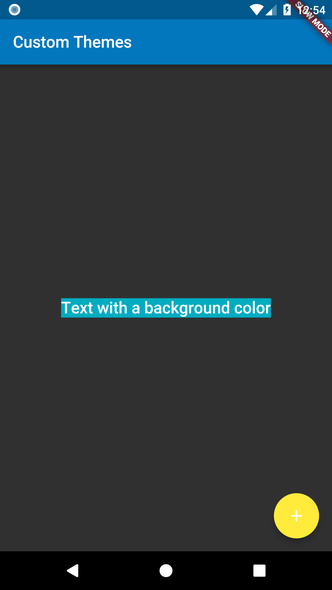
Using a Theme
Now that we’ve defined a theme, we can use it within our Widget build methods
by using the Theme.of(context) function!
Theme.of(context) will look up the Widget tree and return the nearest Theme
in the tree. If we have a stand-alone Theme defined above our Widget, it
returns that. If not, it returns the App theme.
In fact, the FloatingActionButton uses this exact technique to find the
accentColor!
new Container(
  color: Theme.of(context).accentColor,
  child: new Text(
    'Text with a background color',
    style: Theme.of(context).textTheme.title,
  ),
);
Complete Example
import 'package:flutter/foundation.dart';
import 'package:flutter/material.dart';

void main() {
  runApp(new MyApp());
}

class MyApp extends StatelessWidget {
  @override
  Widget build(BuildContext context) {
    final appName = 'Custom Themes';

    return new MaterialApp(
      title: appName,
      theme: new ThemeData(
        brightness: Brightness.dark,
        primaryColor: Colors.lightBlue[800],
        accentColor: Colors.cyan[600],
      ),
      home: new MyHomePage(
        title: appName,
      ),
    );
  }
}

class MyHomePage extends StatelessWidget {
  final String title;

  MyHomePage({Key key, @required this.title}) : super(key: key);

  @override
  Widget build(BuildContext context) {
    return new Scaffold(
      appBar: new AppBar(
        title: new Text(title),
      ),
      body: new Center(
        child: new Container(
          color: Theme.of(context).accentColor,
          child: new Text(
            'Text with a background color',
            style: Theme.of(context).textTheme.title,
          ),
        ),
      ),
      floatingActionButton: new Theme(
        data: Theme.of(context).copyWith(accentColor: Colors.yellow),
        child: new FloatingActionButton(
          onPressed: null,
          child: new Icon(Icons.add),
        ),
      ),
    );
  }
}