Flutter for React Native Developers
This document is for React Native developers looking to apply their existing React Native knowledge to build mobile apps with Flutter. If you understand the fundamentals of the React Native framework, then you can use this document as a jump start to your Flutter development.
- A Brief Introduction to Dart for JavaScript Developers
- Learn The Basics of Flutter
- Project Structure & Resources
- Built-In Widgets
- Views
- What is the equivalent of a
Viewin Flutter? - What is the equivalent of
FlatList/ListView? - How do I use a Canvas to draw/paint?
- Layouts
- How do I lay out my Widgets?
- How do I overlap several widgets on top of one another?
- Styling
- How to custom style my components in Flutter?
- How to use
IconsandColorsin Flutter? - How to add style themes in Flutter?
- State Management
- Routing
- Gesture Detection and Touch Event Handling
- Making HTTP Networking Requests
- Form Input
- Platform-specific code
- Debugging
- Animations
- CheatSheet
A Brief Introduction to Dart for JavaScript Developers
While React Native uses JavaScript, Flutter uses a language called Dart. Dart is an open-source, scalable programming language for building web, server, and mobile apps. It is an object-oriented, single inheritance language that uses a C-style syntax that is AOT-compiled into native and also transcompiles optionally into JavaScript. It supports interfaces, abstract classes and strong types.
Entry Point
While JavaScript does not have any specific entry function, Dart (like C) does have an entry function called main().
// JavaScript
function main() {
  // Can be used as entry point
}
// but it has to be called manually.
main();
// Dart
main() {
}Try it out in DartPad.
Printing to the console
Printing data to the console can be done in the following way.
// JavaScript
console.log("Level completed.");
// Dart
print('Hello World');Try it out in DartPad.
Variables
Creating and Assigning Variables
While JavaScript variables cannot be typed, Dart variables are optionally typed but it is a good practice to use typed variables.
In Dart 2, variables must either be explicitly typed or it must be possible for the type system to infer the proper type automatically. Dart 2 performs both static and runtime type checks, using a sound type system. This type system enables better tooling, as well as earlier feedback when you write code.
// JavaScript
var name = "JavaScript";
// Dart
String name = 'dart';
var otherName = 'Dart'; // Also inferred to be a String in Strong mode.
// Both are acceptable in Dart.Try it out in DartPad.
Default value
In Dart, uninitialized variables have an initial value of null. Even variables with numeric types are initially null because numbers are objects in Dart. But in JavaScript, uninitialized variables are “undefined”.
// JavaScript
var name; // == undefined
// Dart
var name; // == null
int x; // == nullTry it out in the DartPad.
Note: For more information, see the documentation on variables.
Checking for null/zero
In Dart, only the boolean value true is treated as true. But in JavaScript, values like 1 or any non-null objects are treated as true.
// JavaScript
var myNull = null;
if (!myNull) {
  console.log("null is treated as false");
}
var zero = 0;
if (!zero) {
  console.log("0 is treated as false");
}
// Dart
var myNull = null;
if (myNull == null) {
print('use "== null" to check null');
}
var zero = 0;
if (zero == 0) {
print('use "== 0" to check zero');
}Try it out in DartPad.
Functions
For the most part, Dart and JavaScript functions are similar. The only thing that’s different in Dart and JavaScript functions is the declaration.
// JavaScript
function fn() {
  return true;
}
// Dart
fn() {
return true;
}
// can also be written as
bool fn() {
return true;
}Try it out in DartPad.
Note: For more information, see the documentation on functions.
Asynchronous Programming
Futures
Like JavaScript, Dart supports single-threaded execution. In JavaScript, the Promise object represents the eventual completion (or failure) of an asynchronous operation and its resulting value.
// JavaScript
_getIPAddress = () => {
  const url="https://httpbin.org/ip";
  return fetch(url)
    .then(response => response.json())
    .then(responseJson => {
      console.log(responseJson.origin);
    })
    .catch(error => {
      console.error(error);
    });
};
Whereas Dart uses Future objects to handle this.
// Dart
_getIPAddress() {
  final url = 'https://httpbin.org/ip';
  HttpRequest.request(url).then((value) {
      print(JSON.decode(value.responseText)['origin']);
  }).catchError((error) => print(error));
}
Try it out in DartPad.
Note: For more information, see the documentation on Futures.
async / await
The async function declaration defines an asynchronous function. In JavaScript, when an async function is called, it returns a Promise. The await operator is used to wait for a Promise.
// JavaScript
async _getIPAddress() {
  const url="https://httpbin.org/ip";
  const response = await fetch(url);
  const json = await response.json();
  const data = await json.origin;
  console.log(data);
}
Whereas in Dart, an async function returns a Future, and the body of the function is scheduled for execution later. The await operator is used to wait for a Future.
// Dart
_getIPAddress() async {
  final url = 'https://httpbin.org/ip';
  var request = await HttpRequest.request(url);
  String ip = JSON.decode(request.responseText)['origin'];
  print(ip);
}
Try it out in DartPad.
Note: For more information, see the documentation on async/await.
Learn The Basics of Flutter
How do I create a Flutter app?
In React Native, you would start off your development process by creating the project using the below command line tool.
$ create-react-native-app {projectname}In Flutter, you can use this command line tool to do the same.
$ flutter create {projectname}How do I run my app?
In React Native, you would go to the project directory and use
npm run ios/android or yarn run ios/android.
In Flutter, if you are using the terminal, then you use the flutter run command in the project root directory to run your app on a connected device or simulator.
If you are using an IDE like IntelliJ, Android Studio, or VS Code with the Flutter plugin installed then you can use the in-built tools to run the app.
For more information, see the documentation on getting started.
How do I use import statements?
//React Native
import React from "react";
import { StyleSheet, Text, View } from "react-native";
Contrary to React Native’s way of importing each component needed, in Flutter, you import material.dart from the flutter package, which allows you to use any material design widget without explicitly importing it. Dart automatically imports only the widgets that are actually used.
Alternatively, you could import the cupertino widgets, the basic widgets, or your own custom widget library.
import 'package:flutter/material.dart';
import 'package:flutter/cupertino.dart';
import 'package:flutter/widgets.dart';
import 'package:flutter/my_widgets.dart';
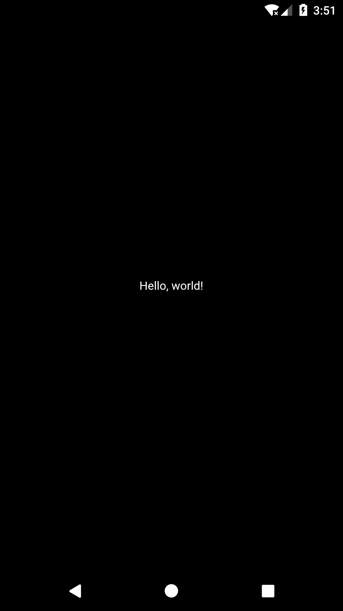
What is the equivalent of the React Native Hello World app in Flutter?
Let’s take a look at how we can define the app in their respective frameworks:
// React Native
import React from "react";
import { StyleSheet, Text, View } from "react-native";

export default class HelloWorldApp extends React.Component {
  render() {
    return (
      <View>
        <Text>Hello World</Text>
      </View>
    );
  }
}
// Flutter
import 'package:flutter/widgets.dart';
void main() {
runApp(
new Center(
child: new Text(
'Hello, world!',
textDirection: TextDirection.ltr,
),
),
);
}The HelloWorldApp class in React Native extends React.Component and implements the render method by returning a view component as shown.
In Flutter, the execution starts off with the main() function inside which a runApp() function is used to take the given Widget and make it the root of the widget tree. In the Flutter example above, the widget tree consists of two widgets, the Center widget and its child, the Text widget.
The text direction needs to be specified in this instance; when a MaterialApp widget is used, this is taken care of for you.
When developing a more complex app you would create another class that is either a Stateless or Stateful widget and also use a MaterialApp widget as the root and pass several other widgets to it.
Preview
| Android | iOS |
|---|---|
 |
 |
How do I use Widgets and nest them to form a Widget tree?
When writing an app, you will commonly author new widgets that are subclasses of either StatelessWidget or StatefulWidget, depending on whether your widget manages any state. In the above Hello World example, HelloWorldApp class extends a StatelessWidget and overrides a build function that describes the widget in terms of other, lower-level widgets.
// Flutter
import 'package:flutter/material.dart';

void main() => runApp(new MyApp());

class MyApp extends StatelessWidget {
  @override
  Widget build(BuildContext context) {
    return new MaterialApp(
      home: new Scaffold(
        appBar: new AppBar(
          title: new Text("Flutter"),
        ),
        body: new Center(
          child: new Text('Hello World'),
        ),
      )
    );
  }
}
In the above example, the widget tree consists of five widgets, the MaterialApp, Scaffold, AppBar, Center, and Text widgets. The MaterialApp wraps a number of widgets that are commonly required for material design applications and the Scaffold implements the basic material design visual layout structure. In simple apps it is easy to nest widgets, but as the code base gets larger and the app becomes complex it is advisable to break deeply nested widgets into functions that return the widget or smaller classes.
Note: You can check the working code for Flutter and its equivalent React Native code.
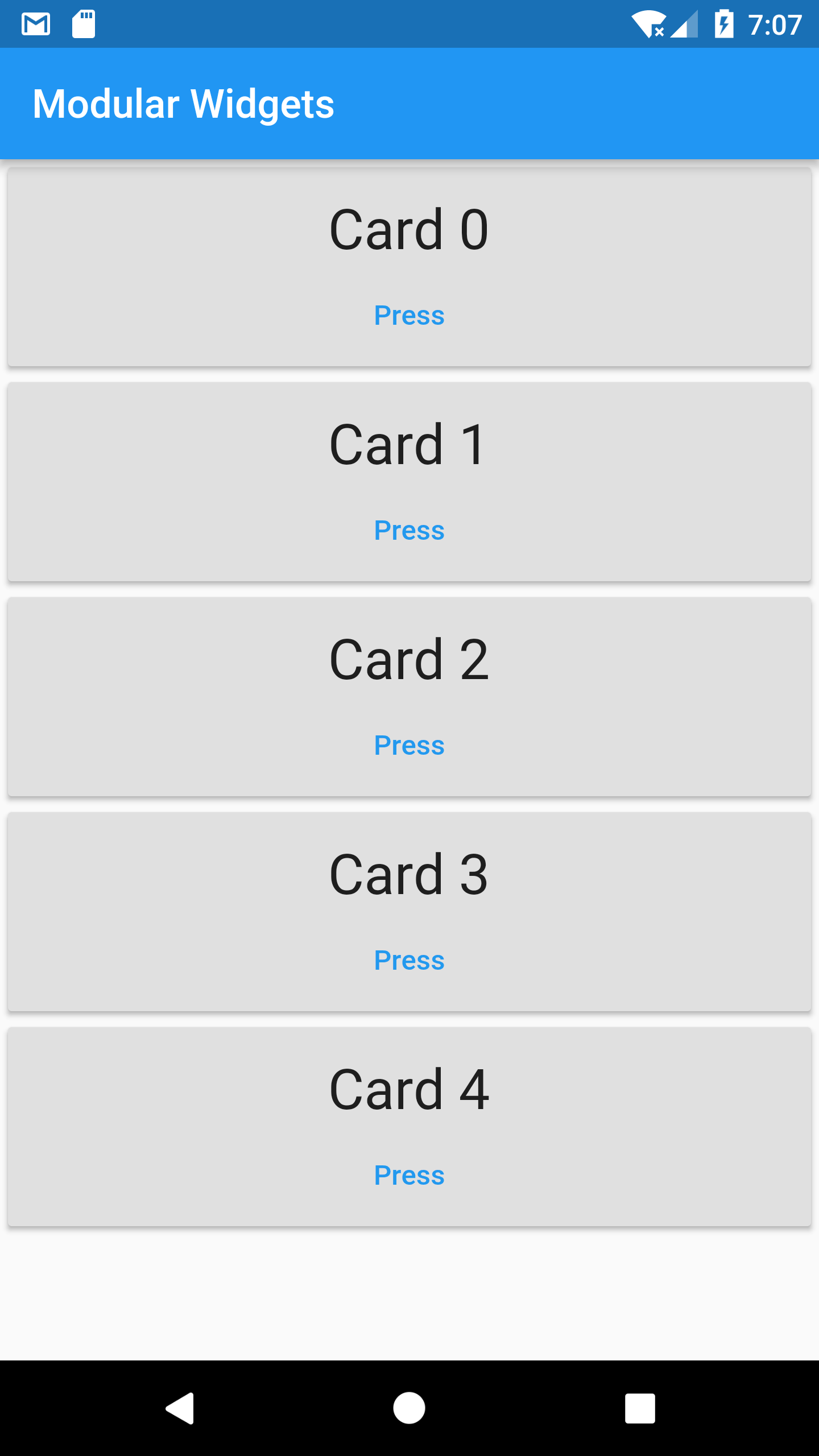
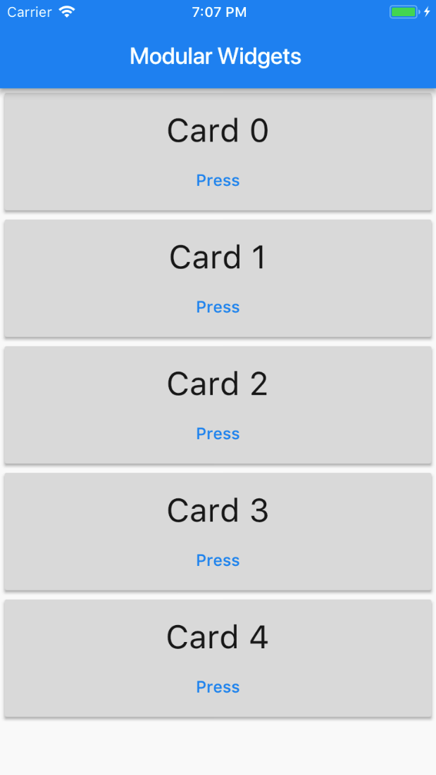
How do I create reusable components and use them?
In React Native, you create a separate class for a reusable component and use that class as a component. You would then use props to access the passed variables and functions. In the below React Native example, we have created a custom card class and used it inside a parent class.
// React Native
class CustomCard extends React.Component {
  render() {
    return (
      <View>
        <Text > Card {this.props.index} </Text>
        <Button
          title="Press"
          onPress={() => this.props.onPress(this.props.index)}
        />
      </View>
    );
  }
}

// Usage
<CustomCard onPress={this.onPress} index={item.key} />
Similarly, in Flutter you just create a class for a custom widget and use that class as you would use a normal widget. Alternatively, you can also create and call a function that returns the widget.
// Flutter
class CustomCard extends StatelessWidget {
  CustomCard({@required this.index, @required this.onPress});

  final index;
  final Function onPress;

  @override
  Widget build(BuildContext context) {
    return new Card(
      child: new Column(
        children: <Widget>[
          new Text('Card $index'),
          new FlatButton(
            child: const Text('Press'),
            onPressed: this.onPress,
          ),
        ],
      )
    );
  }
}
    ...
// Usage
new CustomCard(
  index: index,
  onPress: () {
    print('Card $index');
  },
)
    ...
The constructor for the CustomCard class shows a Dart feature. The curly braces inside the constructor indicates that the parameters are optional when initialising. In order to make these fields required, we have two options- first one is to remove the curly braces from the constructor and the second is to add the @required to the constructor. The latter approach enables the developer to provide parameter names when using the CustomCard class in the app code as show in the (Usage section) example above.
Preview
| Android | iOS |
|---|---|
 |
 |
Note: You can check the working code in Flutter and its equivalent React Native code.
Project Structure & Resources
Where do I start writing the code?
If you have used CRNA (create-react-native-app), then you have written your code inside App.js.
In Flutter, the entry file is ’projectname’/lib/main.dart and execution starts from the main function.
The minimal Flutter app simply calls the runApp() function with a widget. The runApp() function takes the given Widget and makes it the root of the widget tree. Any widget can be passed to it. But, if you are creating an app that uses material design, you can use MaterialApp class as root and define a theme that can be accessed across the app. If you are creating a screen, then you can use Scaffold which implements the basic material design visual layout structure. But that is not mandatory.
How are files structured in a Flutter app?
┬
└ projectname
  ┬
  ├ android
  ├ build
  ├ ios
  ├ lib
    ┬
    └ main.dart
  ├ test
  └ pubspec.yaml
projectname/android - directory containing android-specific files.
projectname/build - stores iOS and Android build files.
projectname/ios - directory containing iOS-specific files.
projectname/lib - externally accessible Dart source files go here. Other source files can be put into /lib/src
projectname/lib/main.dart - the main function, which is start of execution. Also this is where you start writing your dart code.
projectname/test - automated test files.
projectname/pubspec.yaml - metadata for the app. Equivalent of package.json in React Native.
Where do I put my resources (assets) and how do I use them?
In React Native, to add a static image to your app, place it somewhere in your source code tree and reference it like this :
<Image source={require("./my-icon.png")} />Flutter apps can include both code and assets (a.k.a. resources). An asset is a file that is bundled and deployed with your app and is accessible at runtime. Common types of assets include static data (such as JSON files), configuration files, icons, and images (JPEG, GIF, PNG, and BMP). All the assets can live under any folder under the root directory.
For best practice, you can put them in an assets folder.
Flutter uses the pubspec.yaml file, located at the root of your project, to identify assets required by an app.
flutter:
  assets:
    - assets/my_icon.png
    - assets/background.png
When an asset’s path is specified in the assets section of pubspec.yaml, the build process looks for any files with the same name in adjacent subdirectories. Such files are then included in the asset bundle along with the specified asset.
It is used like this in the app code:
image: new AssetImage('assets/background.png'),How do I load images over a network?
In React Native, you specify the uri in the source prop of the Image component and also provide the size if needed.
In Flutter, using NetworkImage creates an object that fetches the image from the given URL.
// Flutter
new NetworkImage("https://example.com/images/background.png"),
How do I install plugins/packages?
In Flutter, you cannot install packages from the command-line like in React Native where you use:
yarn add {package-name} / npm install --save {package-name}.
To install a package in flutter follow these steps:
- Add package name and version to your package’s
pubspec.yamldependencies. The below example shows how to includegoogle_sign_indart package:
dependencies:
  flutter:
    sdk: flutter
  google_sign_in: "^2.0.1"
- Install package from the command line by running
flutter packages get. - Import the package into your code as shown below:
import 'package:google_sign_in/google_sign_in.dart';For more information, see the descriptions of the Flutter packages, including scores to help you compare them.
Built-In Widgets
Flutter widgets are built using a modern reactive-style framework which takes inspiration from React Native. The central idea is that you build your UI out of widgets. Widgets describe what their view should look like given their current configuration and state.
Widgets are the basic building blocks of a Flutter app’s user interface. Each widget is an immutable declaration of part of the user interface. Unlike other frameworks that separate views, view controllers, layouts, and other properties, Flutter has a consistent, unified object model: the widget.
A widget can define:
- a structural element (like a button or menu)
- a stylistic element (like a font or color scheme)
- an aspect of layout (like padding)
Widgets are themselves often composed of many small, single-purpose widgets that combine to produce powerful effects. They form a hierarchy based on composition. Each widget nests inside, and inherits properties from, its parent. There is no separate “application” object. Instead, the root widget serves this role.
Views
What is the equivalent of a View in Flutter?
In React Native, View is a container that supports layout with Flexbox, style, touch handling, and accessibility controls.
In Flutter, we have layout specific widgets like Container, Column, Row, Center etc. You can also use higher-level widgets like the Scaffold widget, which provides options for showing drawers, snack bars, and bottom sheets. Higher-level widgets are built from lower-level widgets using composition (instead of inheritance).
Note: For more information on widgets, see the layout widget catalog.
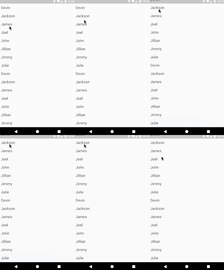
What is the equivalent of FlatList / ListView?
A List is a scrollable list of components arranged linearly. In React Native we use FlatList or ListView for a performant interface for rendering simple, flat lists.
// React Native
<FlatList
  data={[ ... ]}
  renderItem={({ item }) => <Text>{item.key}</Text>}
/>
In Flutter, ListView is Flutter’s most commonly used scrolling widget. The default constructor takes an explicit list of children. It is appropriate to use ListView for a small number of widgets. The ListView.builder constructor takes an IndexedWidgetBuilder, which builds the children on demand. This constructor is appropriate for list views with a large (or infinite) number of children because the builder is called only for those children that are actually visible.
// Flutter
var data = [ ... ];
new ListView.builder(
  itemCount: data.length,
  itemBuilder: (context, int index) {
    return new Text(
      data[index],
    );
  },
)
Preview
| Android | iOS |
|---|---|
 |
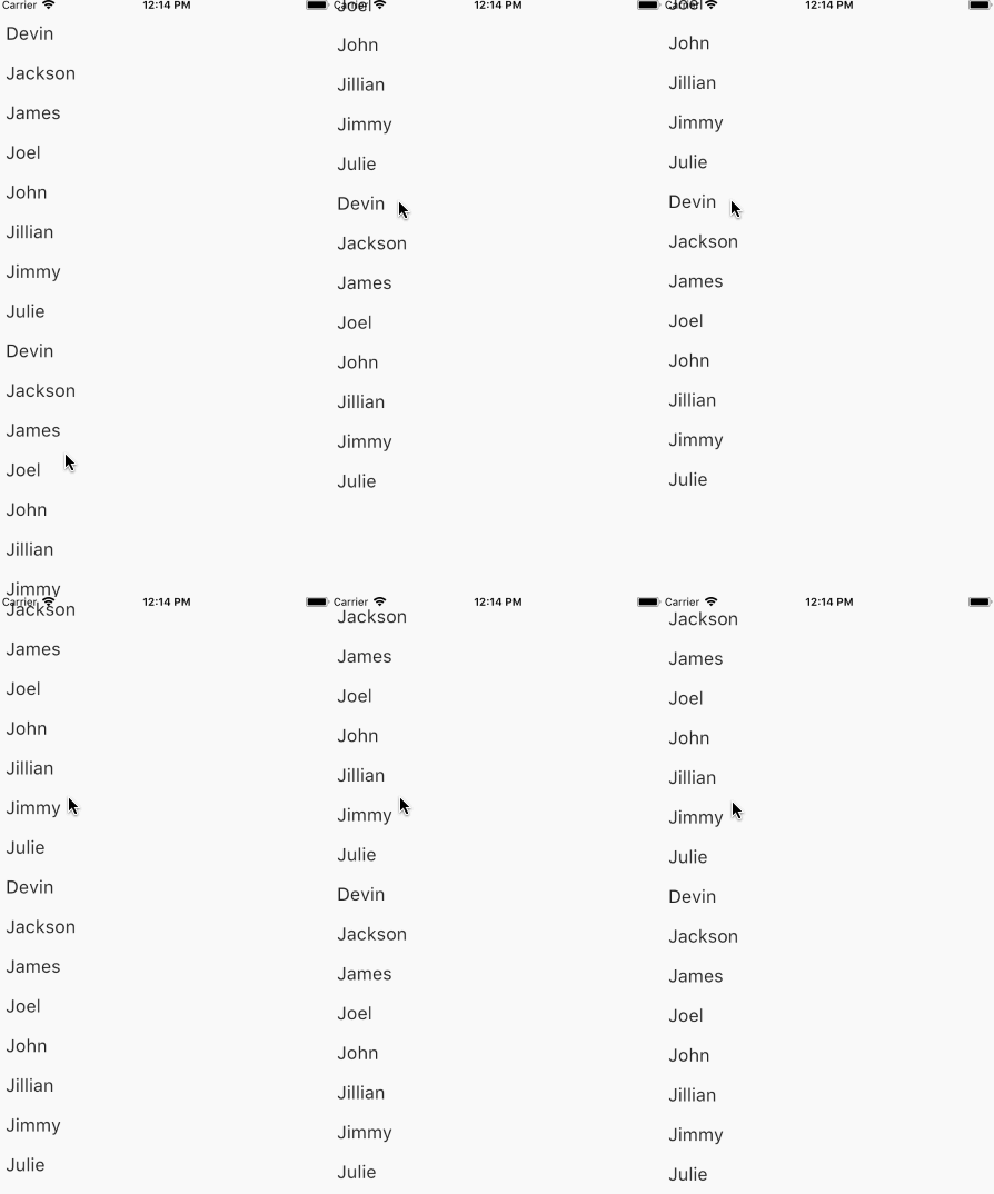 |
Note: You can check the working code for Flutter and its equivalent React Native code.
How do I use a Canvas to draw/paint?
In React Native, no in-built canvas component is present, so we use third party libraries like react-native-canvas to use canvas.
// React Native
handleCanvas = canvas => {
  const ctx = canvas.getContext("2d");
  ctx.fillStyle = "skyblue";
  ctx.beginPath();
  ctx.arc(75, 75, 50, 0, 2 * Math.PI);
  ctx.fillRect(150, 100, 300, 300);
  ctx.stroke();
};

render() {
  return (
    <View>
      <Canvas ref={this.handleCanvas} />
    </View>
  );
}
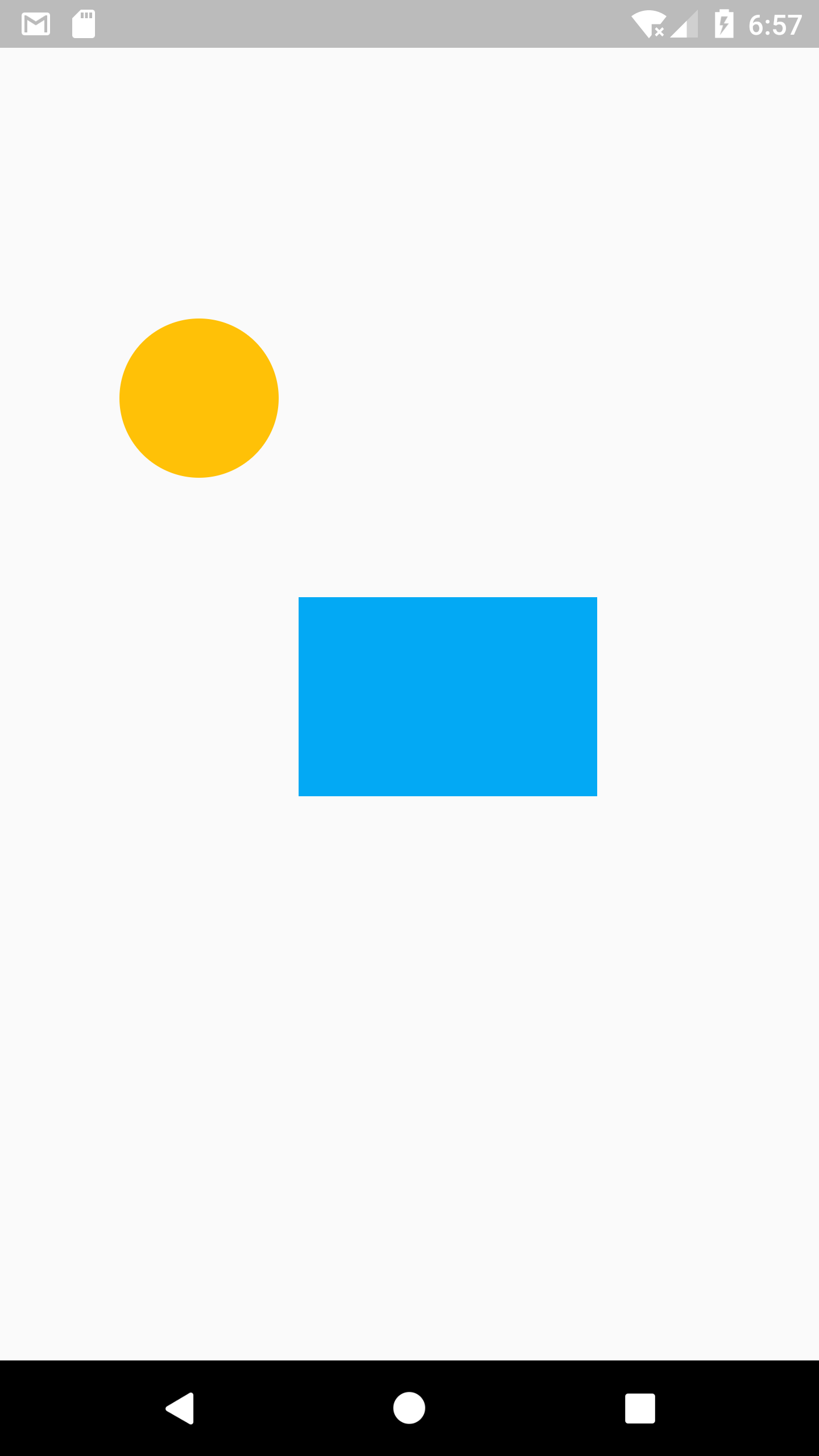
In Flutter, we use CustomPaint widget to draw during the paint phase. We implement abstract class CustomPainter and pass it to painter property in CustomPaint widget.
// Flutter
class MyCanvasPainter extends CustomPainter {

  @override
  void paint(Canvas canvas, Size size) {
    Paint paint = new Paint();
    paint.color = Colors.amber;
    canvas.drawCircle(new Offset(100.0, 200.0), 40.0, paint);
    Paint paintRect = new Paint();
    paintRect.color = Colors.lightBlue;
    Rect rect = new Rect.fromPoints(new Offset(150.0, 300.0), new Offset(300.0, 400.0));
    canvas.drawRect(rect, paintRect);
  }

  bool shouldRepaint(MyCanvasPainter oldDelegate) => false;
  bool shouldRebuildSemantics(MyCanvasPainter oldDelegate) => false;
}
class _MyCanvasState extends State<MyCanvas> {

  @override
  Widget build(BuildContext context) {
    return new Scaffold(
      body: new CustomPaint(
        painter: new MyCanvasPainter(),
      ),
    );
  }
}
Preview
| Android | iOS |
|---|---|
 |
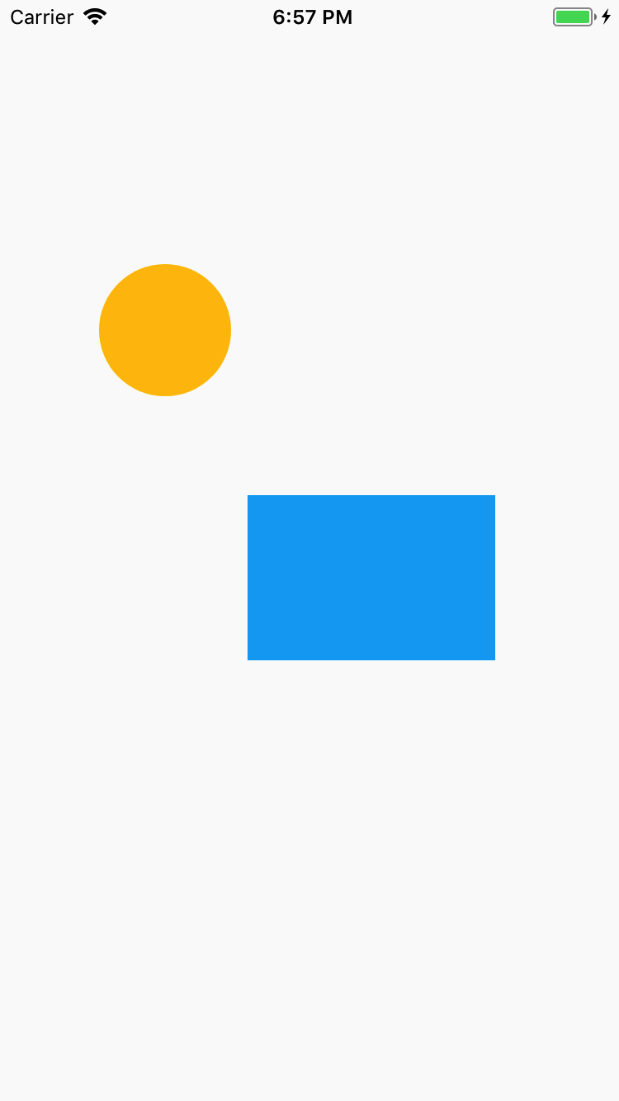 |
Note: You can check the working code for Flutter and its equivalent React Native code.
Layouts
How do I lay out my Widgets?
In React Native, you would normally use the style prop on the view component to specify the flexbox properties to layout the underlying components like this:
// React Native
<View
  style={{
    flex: 1,
    flexDirection: "column",
    justifyContent: "space-between",
    alignItems: "center"
  }}
>
In Flutter, layout is determined by a combination of the type of Widget that you choose and its layout and style properties. Contrary to how it is done in React Native, where most of the layout can be done with the props that are passed to a specific component, in Flutter most of the layout is done by the use of widgets that are specifically designed to provide layout.
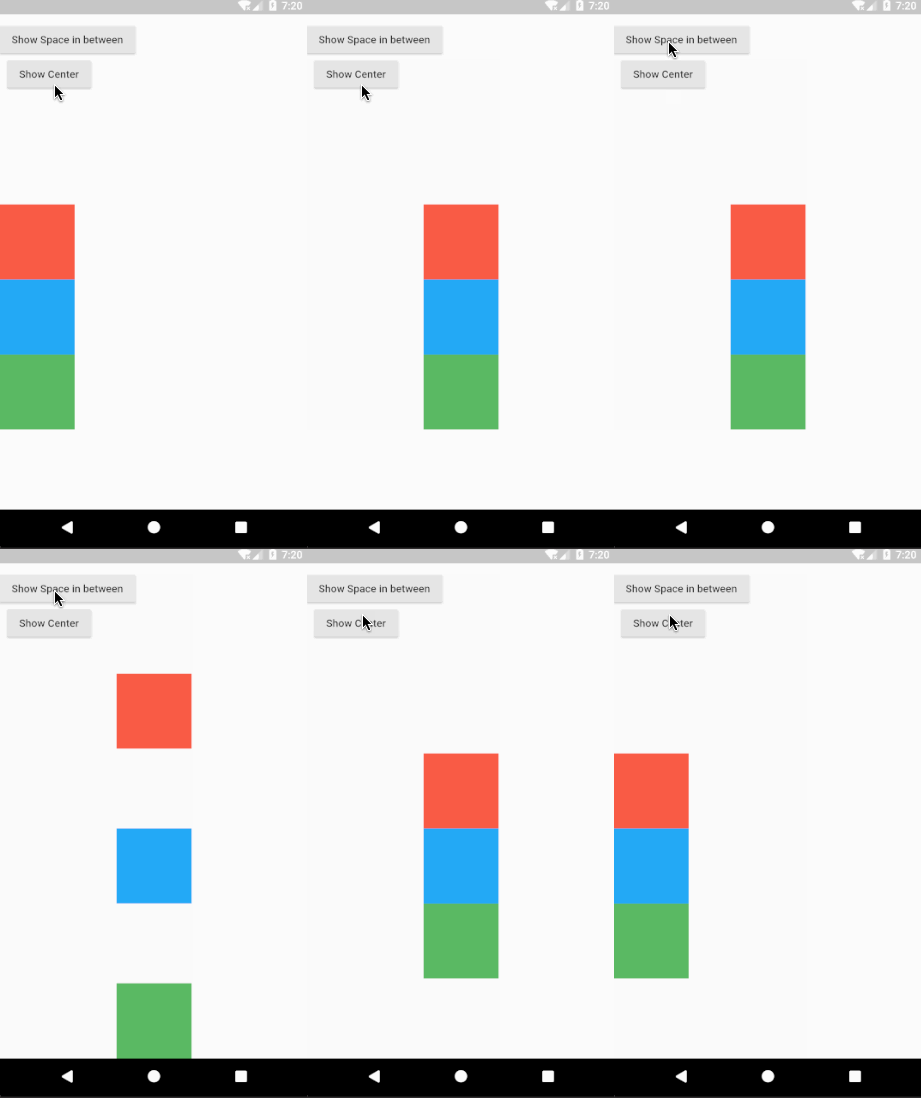
The Flutter widgets Column and Row take an array of children and not styling properties (although there are layout properties such as CrossAxisAlignment and direction) and aligns them vertically and horizontally respectively. A Container takes a combination of layout and styling properties. A Center widget centers its child widget tree.
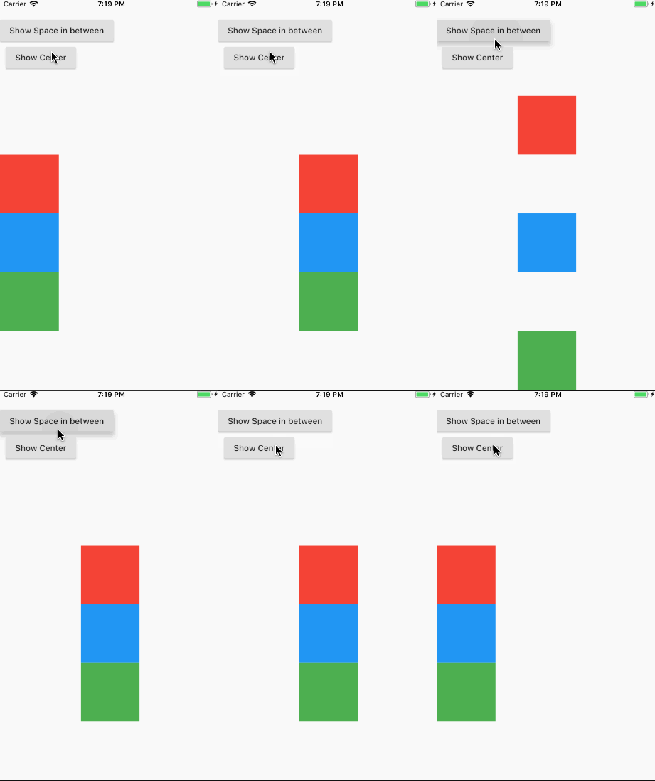
For example, if you want to arrange your components in a Column.
In React Native, you would specify it as a prop: flexDirection: “column”. But in Flutter, you would use a Column widget and provide the required children widgets.
// Flutter
new Center(
  child: new Column(
    children: <Widget>[
      new Container(
        color: Colors.red,
        width: 100.0,
        height: 100.0,
      ),
      new Container(
        color: Colors.blue,
        width: 100.0,
        height: 100.0,
      ),
      new Container(
        color: Colors.green,
        width: 100.0,
        height: 100.0,
      ),
    ],
  ),
)
Other layout widgets available are Padding, Align, Stack.
For more information, see the documentation for the layout widgets.
Preview
| Android | iOS |
|---|---|
 |
 |
Note: You can check the working code for Flutter and its equivalent React Native code.
How do I overlap several widgets on top of one another?
In React Native, we can overlap several components by using absolute positioning.
Flutter uses the Stack widget to arrange children widgets on top of each other. The widgets can entirely or partially overlap the base widget.
The Stack widget positions its children relative to the edges of its box. This class is useful if you simply want to overlap several children.
// Flutter
new Stack(
  alignment: const Alignment(0.6, 0.6),
  children: <Widget>[
    new CircleAvatar(
      backgroundImage: new NetworkImage(
        "https://avatars3.githubusercontent.com/u/14101776?v=4"),
    ),
    new Container(
      decoration: new BoxDecoration(
          color: Colors.black45,
      ),
      child: new Text('Flutter'),
    ),
  ],
)
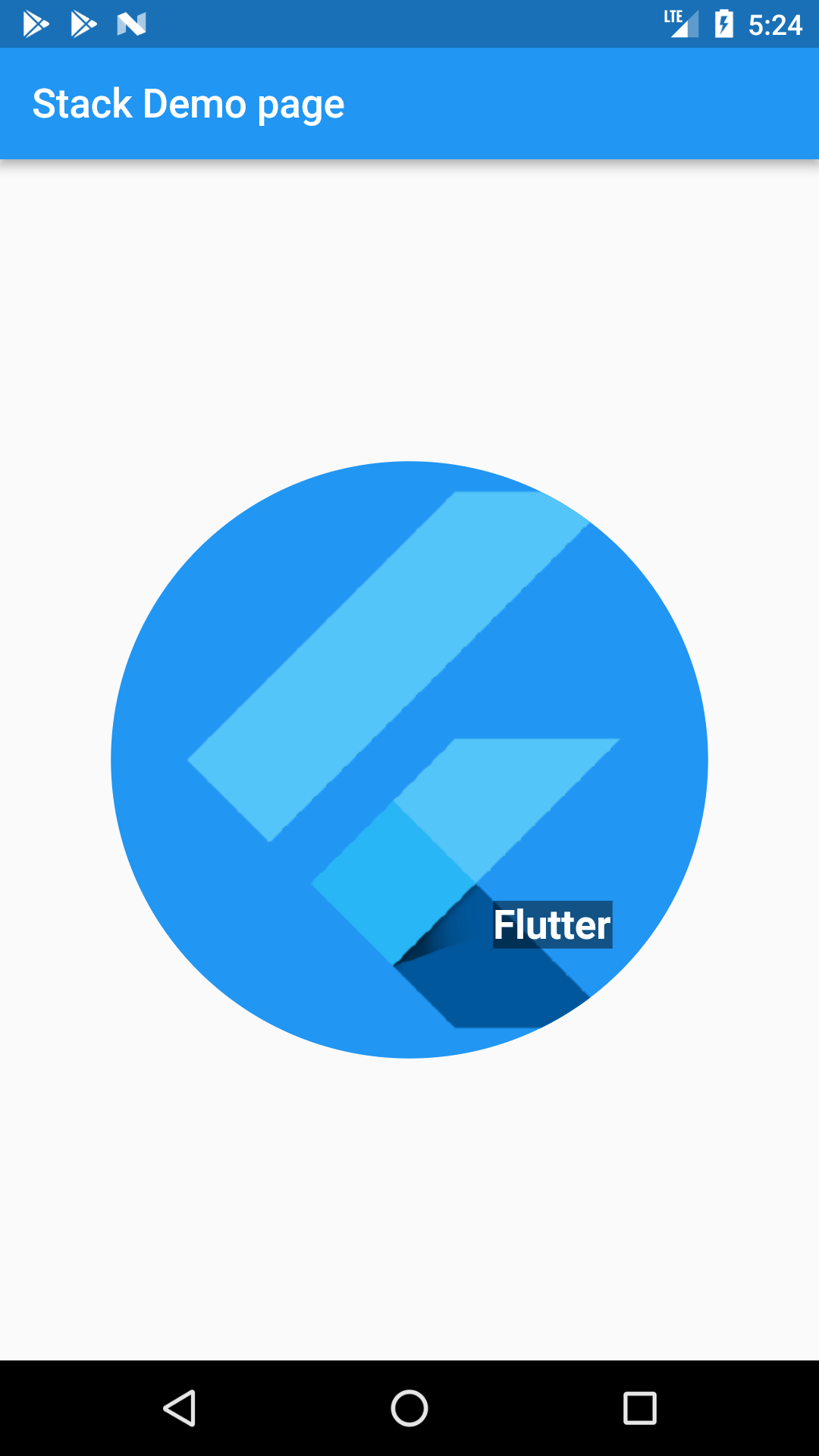
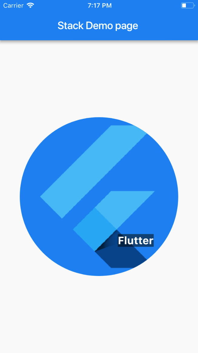
The above example uses Stack to overlay a Container (that displays its Text on a translucent black background) on top of a CircleAvatar. The Stack offsets the text using the alignment property and Alignments.
Preview
| Android | iOS |
|---|---|
 |
 |
Styling
How to custom style my components in Flutter?
In React Native, we can use inline styling as well as stylesheets.create.
// React Native
<View style={styles.container}>
  <Text style={{ fontSize: 32, color: "cyan", fontWeight: "600" }}>
    This is a sample text
  </Text>
</View>
const styles = StyleSheet.create({
container: {
flex: 1,
backgroundColor: "#fff",
alignItems: "center",
justifyContent: "center"
}
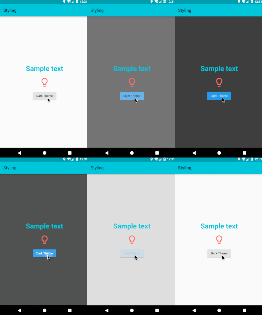
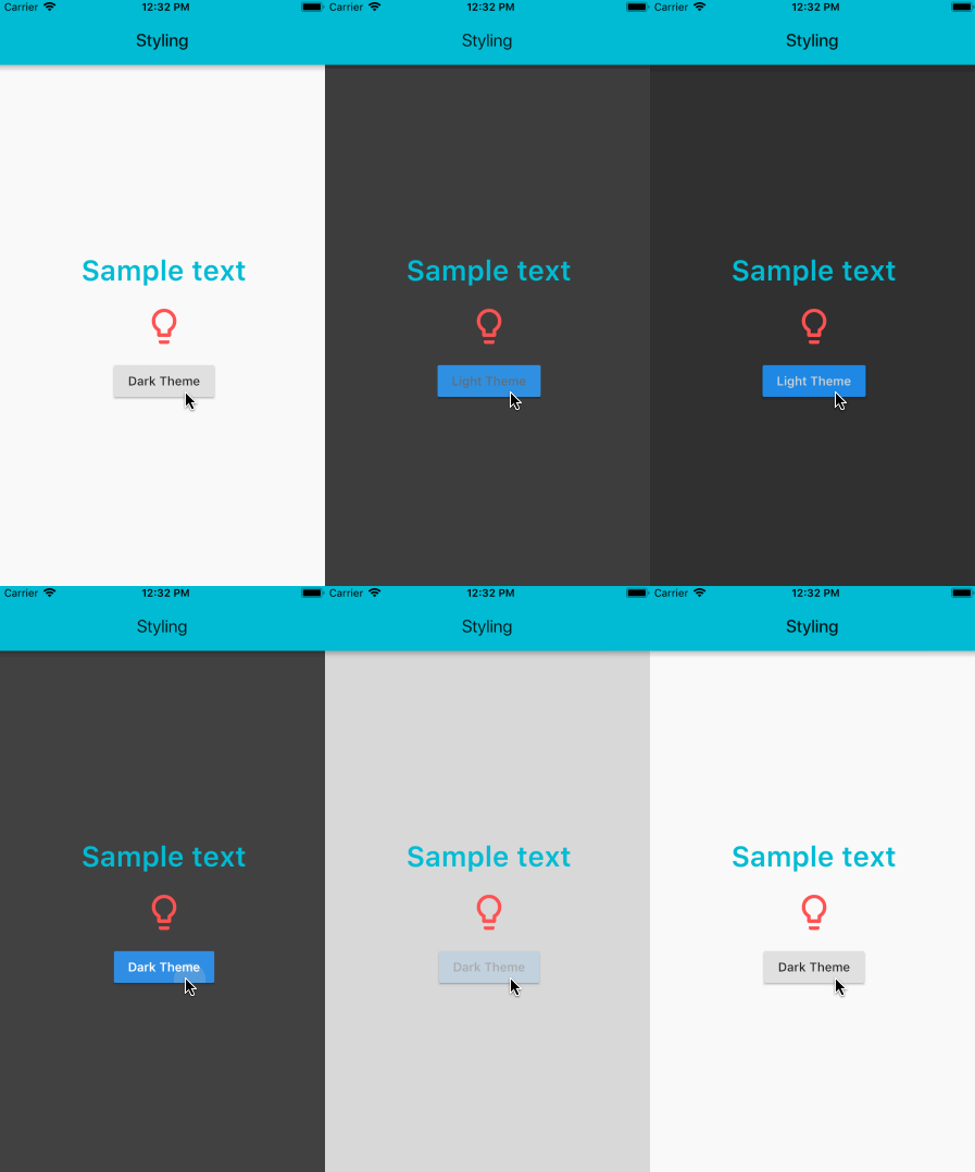
});Similarly in Flutter, widgets are highly customizable and layout specific components like Padding, Center, Card, Stack etc. can be used. A Text widget can take a TextStyle class for its style property. If you want to use same text style at multiple places, you can create a TextStyle class and use it for multiple Text widgets.
// Flutter
var textStyle = new TextStyle(fontSize: 32.0, color: Colors.cyan, fontWeight: FontWeight.w600);
	...
new Center(
  child: new Column(
    children: <Widget>[
      new Text(
        'Sample text',
        style: textStyle,
      ),
      new Padding(
        padding: new EdgeInsets.all(20.0),
        child: new Icon(Icons.lightbulb_outline,
          size: 48.0, color: Colors.redAccent)
      ),
    ],
  ),
)
Preview
| Android | iOS |
|---|---|
 |
 |
Note: You can check the working code for Flutter and its equivalent React Native code.
How to use Icons and Colors in Flutter?
There is no inbuilt support for icons in React Native, so third party libraries have to be used. Flutter has inbuilt support for Material icons as well as Cupertino (iOS-like) icons. To use Material icons, Icons class is used. To use Cupertino icons, make sure you add a dependency on cupertino_icons in your project’s pubspec.yaml file.
Here is the list of all Material icons.
For Colors, Colors class is used which uses Material design’s color palette.
new Icon(Icons.lightbulb_outline, color: Colors.redAccent)How to add style themes in Flutter?
In React Native, we define common themes for components in stylesheets and use it in components.
Similarly, in Flutter we can add uniform styling for almost everything by defining it in the ThemeData class and passing it to the theme property in MaterialApp that wraps all the widgets and acts as the root widget of the app.
@override
Widget build(BuildContext context) {
  return new MaterialApp(
    theme: new ThemeData(
      primaryColor: Colors.cyan,
      brightness: Brightness.dark,
    ),
    home: new StylingPage(),
  );
}
A Theme can be applied even without using the MaterialApp widget. The Theme widget takes a ThemeData in it’s data parameter and applies the ThemeData to all of it’s children widgets. The usage is as shown below:
@override
 Widget build(BuildContext context) {
   return new Theme(
     data: new ThemeData(
       primaryColor: Colors.cyan,
       brightness: brightness,
     ),
     child: new Scaffold(
        backgroundColor: Theme.of(context).primaryColor,
             ...
             ...
     ),
   );
 }
State Management
What are Stateful and Stateless widgets and how do I use them?
In React Native, we do not have state-specific components, you can call setState in any component provided it manages that state.
// React Native
export default class BlinkApp extends Component {

  constructor(props) {
    super(props);
    this.state = {
      buttonText: "blink",
      showText: true,
      text: "I love blinking"
    };
    this.toggleBlinkState = this.toggleBlinkState.bind(this);
    var handle;
  }

  toggleBlinkState() {
    if (this.state.buttonText == "blink") {
      handle = setInterval(() => {
        this.setState(previousState => {
          return { showText: !previousState.showText };
        });
      }, 1000);
      this.setState({
        buttonText: "Stop blinking"
      });
    } else {
      clearInterval(handle);
      this.setState({ buttonText: "blink", showText: true });
    }
  }

  render() {
    let display = this.state.showText ? this.state.text : " ";
    return (
      <View style={{ flex: 1, justifyContent: "center", alignItems: "center" }}>
        <StatusBar hidden={true} />
        <Text>{display} </Text>
        <Button onPress={this.toggleBlinkState} title={this.state.buttonText} />
      </View>
    );
  }
}
In Flutter, we have Stateful and Stateless widgets and you can use setState only in a StatefulWidget.
Stateless Widget
A widget which has no internal state to manage is a Stateless widget. Icons, IconButton, and Text are examples of stateless widgets, which subclass StatelessWidget.
Stateless widgets are useful when the part of the user interface you are describing does not depend on anything other than the configuration information in the object itself and the BuildContext in which the widget is inflated.
// Flutter
import 'package:flutter/material.dart';

void main() => runApp(new MyStatelessWidget(text: "StatelessWidget Example to show immutable data"));

class MyStatelessWidget extends StatelessWidget {
  final String text;
  MyStatelessWidget({Key key, this.text}) : super(key: key);

  @override
  Widget build(BuildContext context) {
    return new Center(
      child: new Text(
        text,
        textDirection: TextDirection.ltr,
      ),
    );
  }
}
In the above example, you will use the constructor of the MyStatelessWidget class to pass the text, which is marked as final. Because this class extends StatelessWidget it can have immutable data.
The build method of a stateless widget is typically only called in three situations:
- When the widget is inserted into the tree
- When the widget’s parent changes its configuration
- When an
InheritedWidgetit depends on changes.
Stateful Widget
A Stateful widget is a widget that has mutable state. A State is information that can be read synchronously when the widget is built and might change during the lifetime of the widget. It is the responsibility of the widget implementer to ensure that the State is promptly notified when such state changes, StatefulWidget is useful when the part of the user interface you are describing can change dynamically. The state of the widget changes when a user interacts with a Stateful widget (by typing into a form, or moving a slider, for example), or when it changes over time (perhaps a data feed causes the UI to update). Checkbox, Radio, Slider, InkWell, Form, and TextField are examples of stateful widgets, which subclass StatefulWidget.
The code snippet below shows how to define a stateful widget and use createState to create a state of the MyStatefulWidget widget.
class MyStatefulWidget extends StatefulWidget {
  MyStatefulWidget({Key key, this.title}) : super(key: key);
  final String title;

  @override
  _MyStatefulWidgetState createState() => new _MyStatefulWidgetState();
}
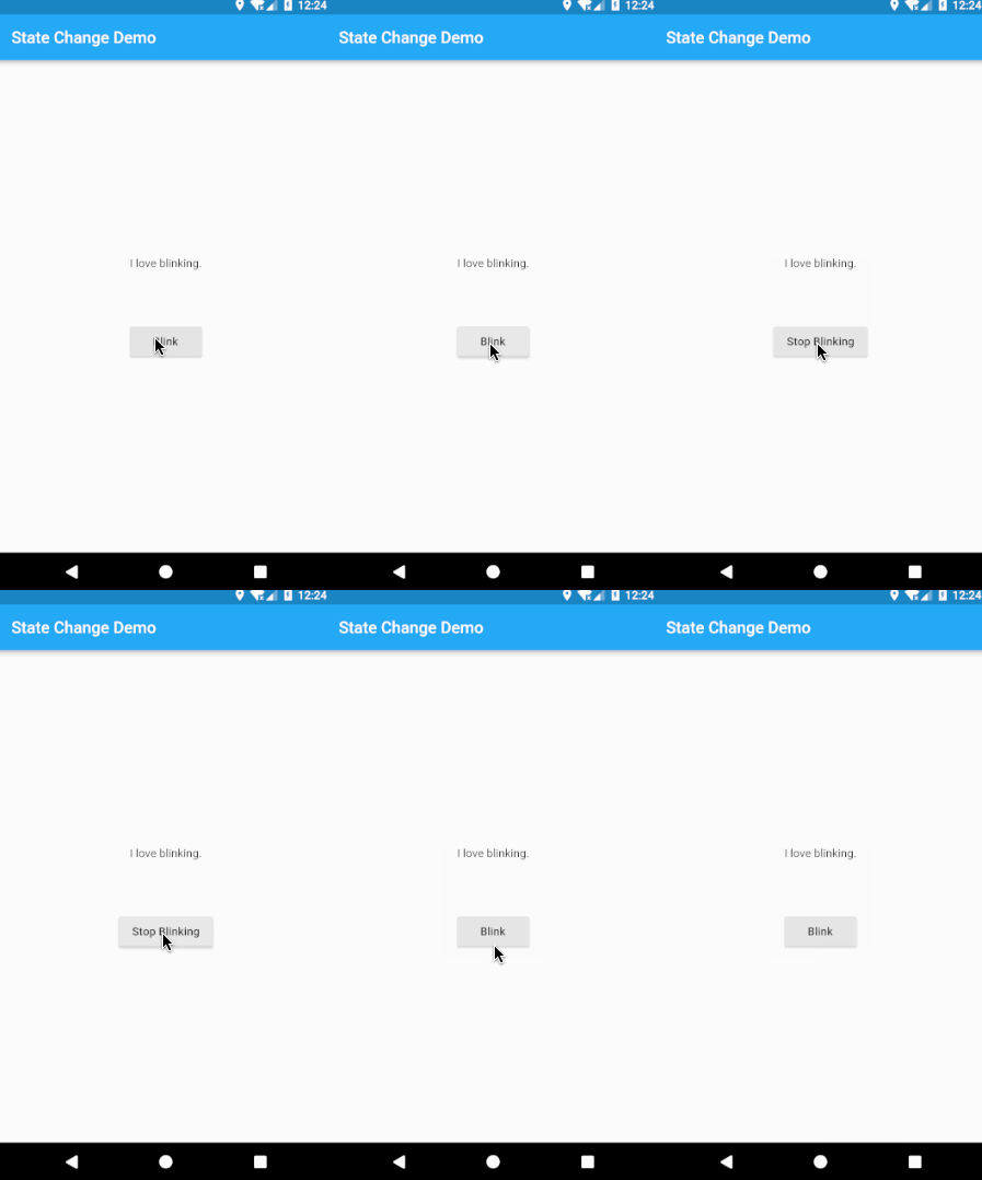
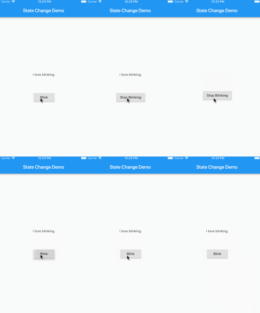
The following code snippet shows how the state implements the build function and also how the setState function is used to rebuild (call the build function of the stateful _MyStatefulWidgetState widget). A Timer is used to periodically call toggleShowText() that uses a setState() to set showText and rebuild.
class _MyStatefulWidgetState extends State<MyStatefulWidget> {
  bool showtext=true;
  bool toggleState=true;
  Timer t2;

  void toggleBlinkState(){
    setState((){
      toggleState=!toggleState;
    });
    var twenty = const Duration(milliseconds: 1000);
    if(toggleState==false) {
      t2 = new Timer.periodic(twenty, (Timer t) {
        toggleShowText();
      });
    } else {
      t2.cancel();
    }
  }

  void toggleShowText(){
    setState((){
      showtext=!showtext;
    });
  }

  @override
  Widget build(BuildContext context) {
    return new Scaffold(
      body: new Center(
        child: new Column(
          children: <Widget>[
            (showtext
              ?(new Text('This execution will be done before you can blink.'))
              :(new Container())
            ),
            new Padding(
              padding: new EdgeInsets.only(top: 70.0),
              child: new RaisedButton(
                onPressed: toggleBlinkState,
                child: (toggleState
                  ?( new Text("Blink"))
                  :(new Text("Stop Blinking"))
                )
              )
            )
          ],
        ),
      ),
    );
  }
}
What are some of the best practices while using Stateful and Stateless widgets?
1. Figure out which widgets must be Stateful and Stateless
Widgets in Flutter can be Stateful or Stateless, depending on whether they depend on some state. If a widget changes—the user interacts with it, it’s Stateful; otherwise it can be Stateless. Stateful widgets are useful when the part of the user interface you are describing can change dynamically.
2. If using Stateful widget, decide which object manages the widget’s state.
There are three main ways to manage state:
- The widget manages its own state.
- The parent manages the widget’s state.
- A mix-and-match approach
How do you decide which approach to use? The following principles should help you decide:
- If the state in question is user data, for example the checked or unchecked mode of a checkbox, or the position of a slider, then the state is best managed by the parent widget.
- If the state in question is aesthetic, for example an animation, then the widget itself best manages the state.
- When in doubt, let the parent widget manage the child widget’s state.
3. Subclass StatefulWidget and State.
The MyStatefulWidget class manages its own state, so it overrides createState() to create the State object. The framework calls createState() when it wants to build the widget. In this example, createState() creates an instance of _MyStatefulWidgetState , which is implemented in the next step.
class MyStatefulWidget extends StatefulWidget {
  MyStatefulWidget({Key key, this.title}) : super(key: key);
  final String title;

  @override
  _MyStatefulWidgetState createState() => new _MyStatefulWidgetState();
}

class _MyStatefulWidgetState extends State<MyStatefulWidget> {

  @override
  Widget build(BuildContext context) {
    ...
  }
}
4. Plug the stateful widget into the widget tree.
Add your custom stateful widget to the widget tree in the app’s build method.
class MyStatelessWidget extends StatelessWidget {
  // This widget is the root of your application.

  @override
  Widget build(BuildContext context) {
    return new MaterialApp(
      title: 'Flutter Demo',
      theme: new ThemeData(
        primarySwatch: Colors.blue,
      ),
      home: new MyStatefulWidget(title: 'State Change Demo'),
    );
  }
}
Preview
| Android | iOS |
|---|---|
 |
 |
Note: You can check the working code for Flutter and its equivalent React Native code.
Props
In React Native, most components can be customized when they are created with different parameters. These creation parameters are called props. These parameters can be used in child component using this.props.
// React Native
class CustomCard extends React.Component {
  render() {
    return (
      <View>
        <Text> Card {this.props.index} </Text>
        <Button
          title="Press"
          onPress={() => this.props.onPress(this.props.index)}
        />
      </View>
    );
  }
}
class App extends React.Component {

  onPress = index => {
    console.log("Card ", index);
  };

  render() {
    return (
      <View>
        <FlatList
          data={[ ... ]}
          renderItem={({ item }) => (
            <CustomCard onPress={this.onPress} index={item.key} />
          )}
        />
      </View>
    );
  }
}
In Flutter, you would just assign a local variable or function marked final with the prop received in the parameterised constructor and use it in the subsequent code.
// Flutter
class CustomCard extends StatelessWidget {

  CustomCard({@required this.index, @required this.onPress});
  final index;
  final Function onPress;

  @override
  Widget build(BuildContext context) {
  return new Card(
    child: new Column(
      children: <Widget>[
        new Text('Card $index'),
        new FlatButton(
          child: const Text('Press'),
          onPressed: this.onPress,
        ),
      ],
    ));
  }
}
    ...
//Usage
new CustomCard(
  index: index,
  onPress: () {
    print('Card $index');
  },
)
Preview
| Android | iOS |
|---|---|
 |
 |
Note: You can check the working code in Flutter and its equivalent React Native code.
Local Storage
How do I store persistent key-value pairs that are global to the app in Flutter?
In React Native, you would use the setItem and getItem functions of the AsyncStorage component to store and retrieve data that is persistent and global to the whole app.
// React Native
await AsyncStorage.setItem( "counterkey", JSON.stringify(++this.state.counter));
AsyncStorage.getItem("counterkey").then(value => {
  if (value != null) {
    this.setState({ counter: value });
  }
});
In Flutter, we use shared_preferences. It is first given as a dependency in the pubspec.yaml as shown:
dependencies:
  flutter:
    sdk: flutter
  shared_preferences: "^0.3.0"
It is then imported in the file where the instance of the shared_preference resides.
import 'package:shared_preferences/shared_preferences.dart';An instance is obtained and used to perform operations such as storing and retrieving data.
SharedPreferences prefs = await SharedPreferences.getInstance();
_counter=prefs.getInt('counter');
prefs.setInt('counter',++_counter);
setState(() {
  _counter=_counter;
});
Routing
How do I navigate between screens in Flutter?
In React Native, there are three main built-in navigators, if you are using react-navigation– StackNavigator, TabNavigator, and DrawerNavigator. Each of these provides a way to configure and define the screens. From the example, this code snippet shows the definition of each of the navigators :
// React Native
const MyApp = TabNavigator(
  { Home: { screen: HomeScreen }, Notifications: { screen: tabNavScreen } },
  { tabBarOptions: { activeTintColor: "#e91e63" } }
);
const SimpleApp = StackNavigator({
  Home: { screen: MyApp },
  stackScreen: { screen: StackScreen }
});
export default (MyApp1 = DrawerNavigator({
  Home: {
    screen: SimpleApp
  },
  Screen2: {
    screen: drawerScreen
  }
}));
In Flutter, there are two main concepts to understand– A Route is an abstraction for a “screen” or “page” of an app and a Navigator is a widget that manages routes.
A Navigator is defined as a widget that manages a set of child widgets with a stack discipline. The navigator manages a stack of Route objects and provides methods for managing the stack, like Navigator.push and Navigator.pop.
Initially, the definition of the routes is provided as a parameter(routes) to the MaterialApp widget. A code snippet from our example is as follows :
// Flutter
class NavigationApp extends StatelessWidget {
  // This widget is the root of your application.
  @override
  Widget build(BuildContext context) {
    return new MaterialApp(
            ...
      routes: <String, WidgetBuilder>{
        '/a': (BuildContext context) => new usualNavscreen(),
        '/b': (BuildContext context) => new drawerNavscreen(),
      }
            ...
  );
  }
}
To navigate to a named route, the of method of the Navigator widget is used to specify the BuildContext (a handle to the location of a widget in the widget tree) and the name of the route is passed to pushNamed function to navigate to the specifed route as shown below:
Navigator.of(context).pushNamed('/a');One can also use the push method of Navigator which adds the given route to the history of the navigator that most tightly encloses the given context, and transitions to it. In the following example we are using the MaterialPageRoute widget, which is a modal route that replaces the entire screen with a platform-adaptive transition. It takes a WidgetBuilder as a required parameter.
Navigator.push(context, new MaterialPageRoute(builder: (BuildContext context) => new UsualNavscreen()));How do I use Tab Navigation and Drawer Navigation in Flutter?
In React Native, we define Tab and Drawer navigators and use them to show tabs and drawers, and navigate.
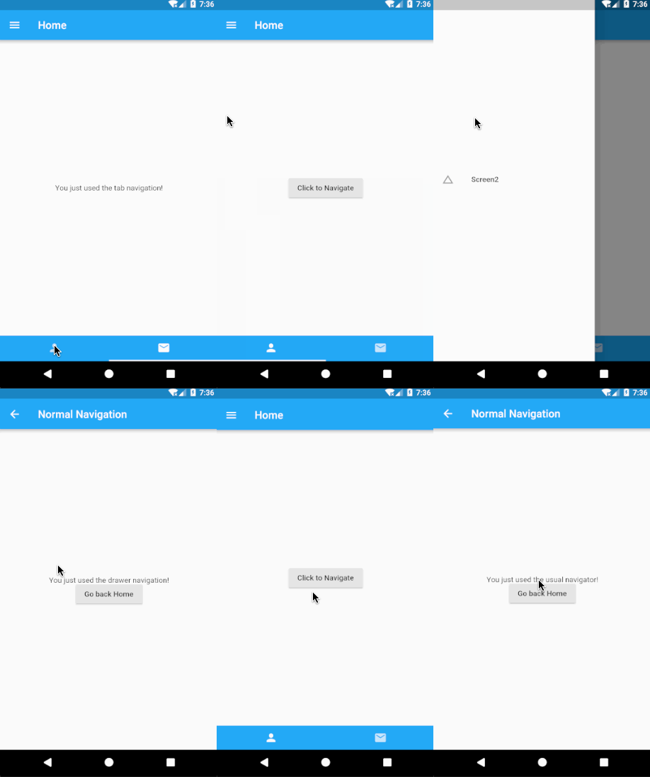
In Flutter, we make use of several lower-level widgets such as Drawer which is basically a material design panel that slides in horizontally and TabBar, TabBarView to show and navigate among Tabs. These lower-level widgets are used in combination with higher-level widget Scaffold which implements them internally. The drawer and bottomNavigationBar parameters of the Scaffold are provided with the above mentioned lower-level widgets.
Tab Navigation
In React Native, we can use TabNavigation. A code snippet from our example is as follows:
// React Native
const MyApp = TabNavigator(
  { Home: { screen: HomeScreen }, Notifications: { screen: tabNavScreen } },
  { tabBarOptions: { activeTintColor: "#e91e63" } }
);
In Flutter, we need to use two main widgets - TabBar and TabBarView.
A TabBar Widget is used to create a TabBar and Tab widgets are passed as children to the TabBar widget as shown below:
// Flutter
TabController controller=new TabController(length: 2, vsync: this);

new TabBar(
  tabs: <Tab>[
    new Tab(icon: new Icon(Icons.person),),
    new Tab(icon: new Icon(Icons.email),),
  ],
  controller: controller,
),
Also, a TabController must be passed. A TabController coordinates tab selection between a TabBar and a TabBarView.
The length argument of the TabController’s constructor is the total number of tabs. Typically greater than one.
vsync is the TickerProvider that can be used. TickerProvider is an interface implemented by classes that can vend Ticker objects. Tickers can be used by any object that wants to be notified whenever a frame triggers, but are most commonly used indirectly via an AnimationController. AnimationControllers need a TickerProvider to obtain their Ticker. If you are creating an AnimationController from a State, then you can use the TickerProviderStateMixin or SingleTickerProviderStateMixin classes to obtain a suitable TickerProvider.
TabBarView widget is passed as the body parameter of the Scaffold widget. All the screens corresponding to the TabBar widget’s tabs are given as children to TabBarView widget along with the same TabController as shown:
// Flutter

class _NavigationHomePageState extends State<NavigationHomePage> with SingleTickerProviderStateMixin {
  TabController controller=new TabController(length: 2, vsync: this);
  @override
  Widget build(BuildContext context) {
    return new Scaffold(
      bottomNavigationBar: new Material (
        child: new TabBar(
          tabs: <Tab> [
            new Tab(icon: new Icon(Icons.person),)
            new Tab(icon: new Icon(Icons.email),),
          ],
          controller: controller,
        ),
        color: Colors.blue,
      ),
      body: new TabBarView(
        children: <Widget> [
          new home.homeScreen(),
          new tabScreen.tabScreen()
        ],
        controller: controller,
      )
    );
  }
}
Drawer navigation
In React Native, we can use DrawerNavigation like this:
// React Native
export default (MyApp1 = DrawerNavigator({
  Home: {
    screen: SimpleApp
  },
  Screen2: {
    screen: drawerScreen
  }
}));
In Flutter, we make use of a Drawer widget which is a material design panel that slides in horizontally from the edge of a Scaffold to show navigation links in an application. You can provide a Button, a Text widget or a List of items to display as the child to the Drawer widget. In our example here, we have used a ListTile widget and provided navigation on tap.
// Flutter
new Drawer(
  child:new ListTile(
    leading: new Icon(Icons.change_history),
    title: new Text('Screen2'),
    onTap: () {
      Navigator.of(context).pushNamed("/b");
    },
  ),
  elevation: 20.0,
),
Drawers are typically used with the Scaffold.drawer property. The AppBar automatically displays an appropriate IconButton to show the Drawer when a Drawer is available in the Scaffold. The Scaffold automatically handles the edge-swipe gesture to show the drawer.
// Flutter
@override
Widget build(BuildContext context) {
  return new Scaffold(
    drawer: new Drawer(
      child: new ListTile(
        leading: new Icon(Icons.change_history),
        title: new Text('Screen2'),
        onTap: () {
          Navigator.of(context).pushNamed("/b");
        },
      ),
      elevation: 20.0,
    ),
    appBar: new AppBar(
      title: new Text("Home"),
    ),
    body: new Container(),
  );
}
Preview
| Android | iOS |
|---|---|
 |
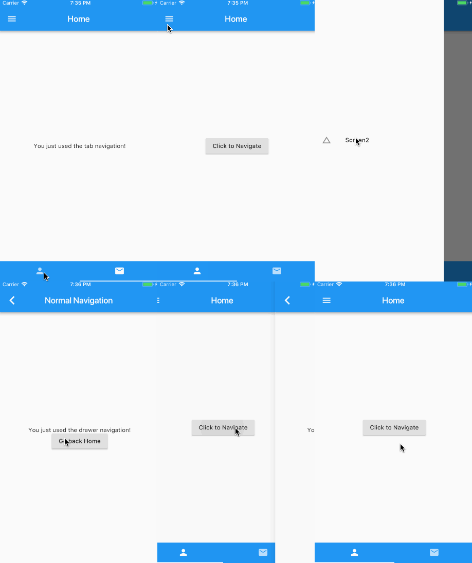 |
Note: You can check the working code for Flutter and its equivalent React Native code.
Gesture Detection and Touch Event Handling
How do I add a click/press listeners to a widget in Flutter?
In React Native, we can add various listeners to components using Touchables component or use PanResponder.
// React Native
<TouchableOpacity
  onPress={() => {
    console.log("Press");
  }}
  onLongPress={() => {
    console.log("Long Press");
  }}
>
  <Text>Tap or Long Press</Text>
</TouchableOpacity>
For more complex gestures and combining several touches into a single gesture, we use PanResponders in React Native.
// React Native
class App extends Component {

  componentWillMount() {
    this._panResponder = PanResponder.create({
      onMoveShouldSetPanResponder: (event, gestureState) =>
        !!getDirection(gestureState),
      onPanResponderMove: (event, gestureState) => true,
      onPanResponderRelease: (event, gestureState) => {
        const drag = getDirection(gestureState);
      },
      onPanResponderTerminationRequest: (event, gestureState) => true
    });
  }

  render() {
    return (
      <View style={styles.container} {...this._panResponder.panHandlers}>
        <View style={styles.center}>
          <Text>Swipe Horizontally or Vertically</Text>
        </View>
      </View>
    );
  }
}
In Flutter, one way to achieve this is using buttons or touchable widgets which have onPress parameters. Another way is by wrapping widgets in a GestureDetector widget which can add event detection to any widget by just passing the function in the respective callback.
// Flutter
new GestureDetector(
  child: new Scaffold(
    appBar: new AppBar(
      title: new Text("Gestures"),
    ),
    body: new Center(
      child: new Column(
        mainAxisAlignment: MainAxisAlignment.center,
        children: <Widget>[
          new Text('Tap, Long Press, Swipe Horizontally or Vertically '),
        ],
      )
    ),
  ),
  onTap: () {
    print('Tapped');
  },
  onLongPress: () {
    print('Long Pressed');
  },
  onVerticalDragEnd: (DragEndDetails value) {
    print('Swiped Vertically');
  },
  onHorizontalDragEnd: (DragEndDetails value) {
    print('Swiped Horizontally');
  },
);
Here is the list of all Flutter GestureDetector callbacks.
Preview
| Android | iOS |
|---|---|
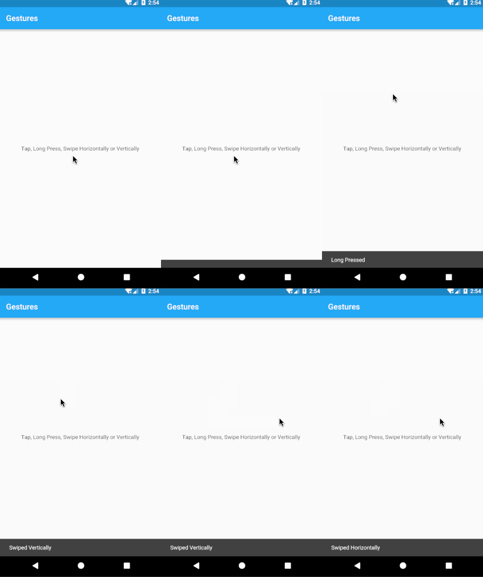 |
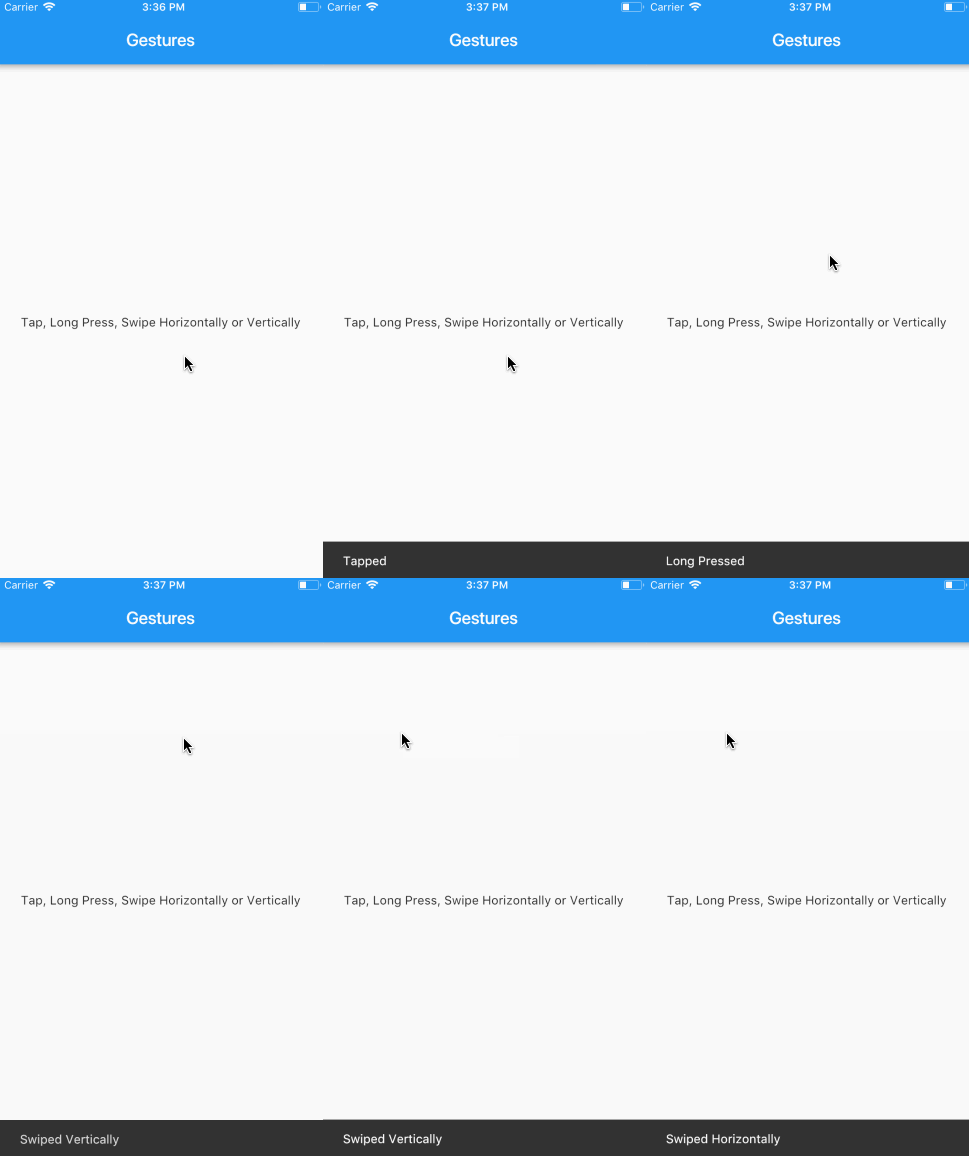 |
Note: You can check the working code for Flutter and its equivalent React Native code.
Making HTTP Networking Requests
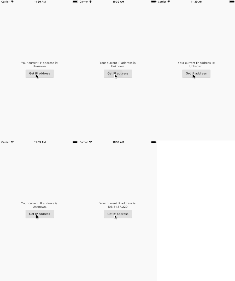
How do I fetch data from API calls?
React Native provides the Fetch API for networking. You just have to make a fetch request and then handle the response to get the data.
// React Native
_getIPAddress = () => {
  fetch("https://httpbin.org/ip")
    .then(response => response.json())
    .then(responseJson => {
      this.setState({ _ipAddress: responseJson.origin });
    })
    .catch(error => {
      console.error(error);
    });
};
A similar flow is followed in Flutter but it uses the dart:io core HTTP support, so to create an HTTP Client we need to add an import.
import 'dart:io';The client supports HTTP operations, such as GET, POST, PUT, DELETE.
// Flutter
final url = new Uri.https('httpbin.org', 'ip');
final httpClient = new HttpClient();
_getIPAddress() async {
  var request = await httpClient.getUrl(url);
  var response = await request.close();
  var responseBody = await response.transform(UTF8.decoder).join();
  String ip = JSON.decode(responseBody)['origin'];
  setState(() {
    _ipAddress = ip;
  });
}
Preview
| Android | iOS |
|---|---|
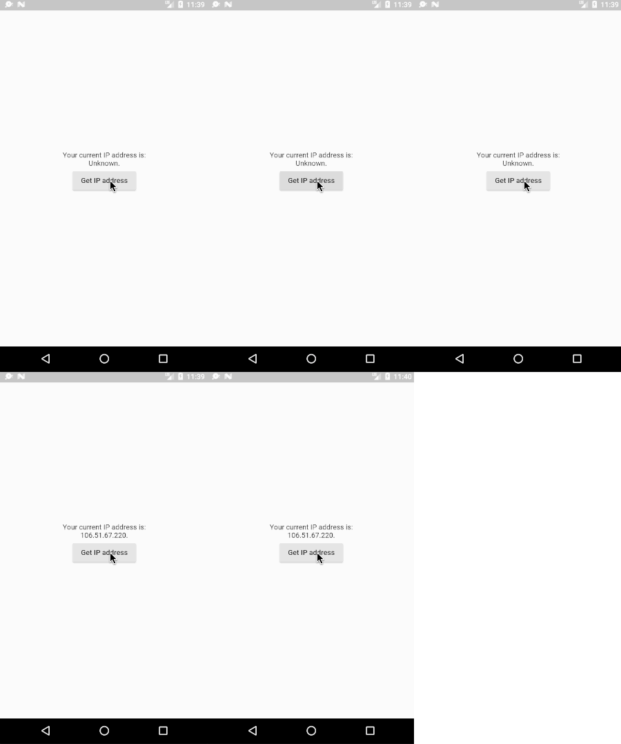 |
 |
Note: You can check the working code for Flutter and its equivalent React Native code.
Form Input
How do I use TextInput field in Flutter?
In React Native, typically you would use a TextInput component to show a text input box and use the callback to store the value in a variable.
// React Native
<TextInput
  placeholder="Enter your Password"
  onChangeText={password => this.setState({ password })}
 />
<Button title="Submit" onPress={this.validate} />
In Flutter, we use a TextEditingController to manage a TextField. Whenever the text field is modified, the controller notifies its listeners. Listeners can then read the text and selection properties to learn what the user has typed. You can access the text in TextField by the text property of the controller.
// Flutter
final TextEditingController _controller = new TextEditingController();
      ...
new TextField(
  controller: _controller,
  decoration: new InputDecoration(
    hintText: 'Type something', labelText: "Text Field "
  ),
),
new RaisedButton(
  child: new Text('Submit'),
  onPressed: () {
    showDialog(
      context: context,
        child: new AlertDialog(
          title: new Text('Alert'),
          content: new Text('You typed ${_controller.text}'),
        ),
     );
   },
 ),
)
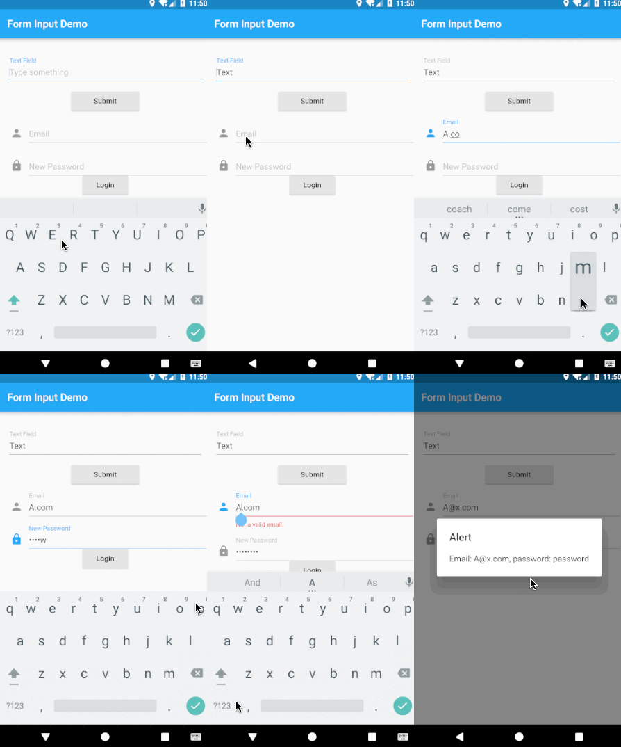
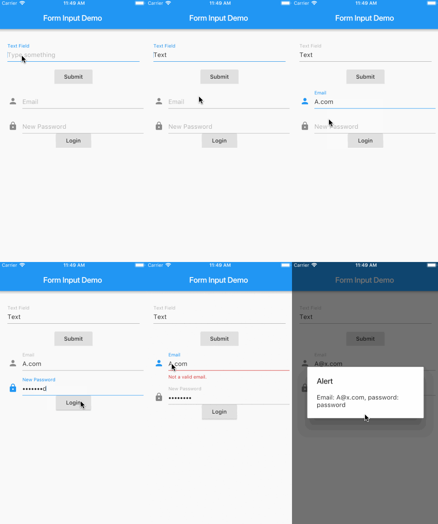
In this example, when the user clicks on the submit button an alert dialog opens up and displays the current text entered in the text field. This is achieved by the use of an alertDialog widget that displays the alert message and the text from the TextField is accessed by the text property of the TextEditingController.
How do I use Forms in Flutter?
In Flutter, we use a Form widget, where TextFormField widgets along with the submit button are passed as children. The TextFormField widget has a parameter called onSaved which takes a callback and executes when the form is saved.
A FormState object is used to save, reset, or validate each FormField that is a descendant of this Form. To obtain the FormState, you may use Form.of with a context whose ancestor is the Form, or pass a GlobalKey to the Form constructor and call GlobalKey.currentState.
final formKey = new GlobalKey<FormState>();

...

new Form(
  key:formKey,
  child: new Column(
    children: <Widget>[
      new TextFormField(
        validator: (value) => !value.contains('@') ? 'Not a valid email.' : null,
        onSaved: (val) => _email = val,
        decoration: const InputDecoration(
          hintText: 'Enter your email',
          labelText: 'Email',
        ),
      ),
      new RaisedButton(
        onPressed: _submit,
        child: new Text('Login'),
      ),
    ],
  ),
)
The following code snippet shows how Form.save() and formKey which is a GlobalKey is used to save the form on submit.
void _submit() {
  final form = formKey.currentState;
  if (form.validate()) {
    form.save();
    showDialog(
      context: context,
      child: new AlertDialog(
        title: new Text('Alert'),
        content: new Text('Email: $_email, password: $_password'),
      )
    );
  }
}
Preview
| Android | iOS |
|---|---|
 |
 |
Note: You can check out the working code for Flutter and React Native
Platform-specific code
When building a cross-platform app, you’ll want to re-use as much code as possible across platforms. Scenarios may arise where it makes sense for the code to be different. In React Native, separate implementation can be given at almost anywhere in the app code by recognizing the platform the app will run on. To get the target platform, you need to use this component :
// React Native
if (Platform.OS === "ios") {
  return "iOS";
} else if (Platform.OS === "android") {
  return "android";
} else {
  return "not recognised";
}
The same goes in Flutter,
// Flutter
if (Theme.of(context).platform == TargetPlatform.iOS) {
  return "iOS";
} else if (Theme.of(context).platform == TargetPlatform.android) {
  return "android";
} else if (Theme.of(context).platform == TargetPlatform.fuchsia) {
  return "fuchsia";
} else {
  return "not recognised ";
}
Debugging
How do I access the In-App Developer Menu?
In React Native, the developer menu can be accessed by shaking your device: ⌘D for the iOS Simulator or ⌘M for Android emulator.
In Flutter, if you are using an IDE, you can use its built-in tools. If you start your application using flutter run you can also access the menu by typing h in the terminal window, or type the following shortcuts:
| Action | Terminal Shortcut | Debug functions/ properties |
|---|---|---|
| Widget hierarchy of the app | w |
debugDumpApp() |
| Rendering tree of the app | t |
debugDumpRenderTree() |
| Layers | L |
debugDumpLayerTree() |
| Accessibility | S (traversal order) or U (inverse hit test order) |
debugDumpSemantics() |
| To toggle the widget inspector | i |
WidgetsApp. showWidgetInspectorOverride |
| To toggle the display of construction lines | p |
debugPaintSizeEnabled |
| To simulate different operating systems | o |
defaultTargetPlatform |
| To display the performance overlay | P |
WidgetsApp. showPerformanceOverlay |
| To save a screenshot to flutter. png | s |
|
| To quit | q |
How do I perform hot reload?
Instead of recompiling your app every time you make a change, you can reload your app instantly. The app is updated to reflect your change, and the current state of the app is preserved.
In React Native, the shortcut is ⌘R for the iOS Simulator and tapping R twice on Android emulators.
In Flutter, If you are using IntelliJ IDE or Android Studio, you can select Save All (⌘s/ctrl-s), or click the Hot Reload button on the toolbar.
If you are running the app at the command line using flutter run, type r in the terminal window.
You can also perform full restart by typing R in the terminal window.
Is there anything like Chrome Developer Tools in Flutter?
In Flutter, the Dart Observatory is used for debugging. If you have started your application using flutter run, you can open the Web page at the Observatory URL printed to the console (e.g., http://127.0.0.1:8100/). If you are using an IDE, you can also debug your application using its built-in debugger.
The Observatory also supports profiling, examining the heap, observing executed lines of code, debugging memory leaks and memory fragmentation, etc. For more information, see the Observatory’s documentation.
The Flutter plugin v21 announced a new feature called “Flutter Inspector” for IntelliJ and Android Studio. The inspector makes it much easier to understand why your application is rendering the way it does. It allows you to:
- View the UI structure of your app as a tree of widgets.
- Select a point on your device or simulator and find the corresponding Widget that rendered those pixels.
- View properties for individual widgets.
- Generally, better understand layout issues.
The inspector view can be opened via View > Tool Windows > Flutter Inspector (it shows content only when an app is running). To inspect a specific widget, select the ‘Toggle inspect mode’ action in the toolbar, then click on the desired widget on the phone or simulator. The widget will be highlighted in your app’s UI, you’ll see the widget in the widget hierarchy in IntelliJ, and will be able to view the individual properties for that widget.
Note: For more details, see the documentation on debugging in Flutter.
Animations
For a great user experience, animations are essential. In React Native, we use Animated API to create animations.
In Flutter, we use the Animation class and AnimationController class. Animation is an abstract class that understands its current value and its state (completed or dismissed). The AnimationController class lets you play an animation forward or in reverse, or stop animation and set the animation to a specific value.
How do I add a simple fade-in animation?
In the React Native example, we use an animated component FadeInView using Animated API. We define initial opacity state, final state, the duration over which transition happens. We add animation component inside Animated component, then we map the opacity state fadeAnim to the opacity of the Text component we want to animate. Then, finally, we start() the animation.
// React Native
class FadeInView extends React.Component {
  state = {
    fadeAnim: new Animated.Value(0) // Initial value for opacity: 0
  };
  componentDidMount() {
    Animated.timing(this.state.fadeAnim, {
      toValue: 1,
      duration: 10000
    }).start();
  }
  render() {
    return (
      <Animated.View style={{...this.props.style, opacity: this.state.fadeAnim }} >
        {this.props.children}
      </Animated.View>
    );
  }
}
    ...
<FadeInView>
  <Text> Fading in </Text>
</FadeInView>
    ...
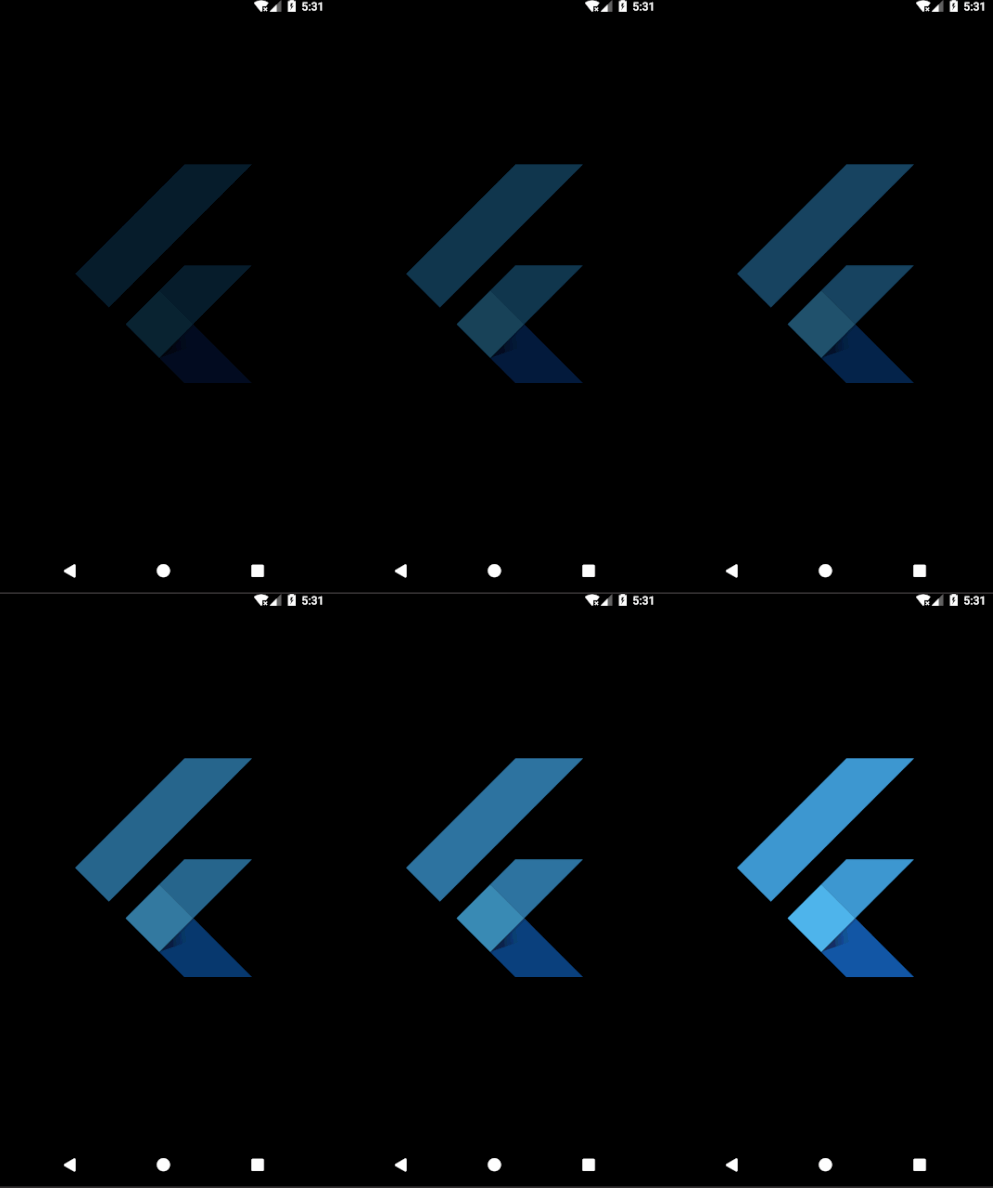
In the equivalent Flutter example, we use an AnimationController object controller and specify the duration inside it. We animation is defined as a Tween which basically describes some interpolation between a beginning and ending value. We are using a FadeTransition widget where we have opacity property which is mapped to the animation object. The sole job of a Tween is to define a mapping from an input range to an output range. Then we start the animation using controller.forward(). We can perform other operations too using the controller. In the example, We are using the FlutterLogo inside the FadeTransition widget.
// Flutter
void main() {
  runApp(new Center(child: new LogoFade()));
}

class LogoFade extends StatefulWidget {
  _LogoFadeState createState() => new _LogoFadeState();
}

class _LogoFadeState extends State<LogoFade> with TickerProviderStateMixin {
  Animation animation;
  AnimationController controller;

  initState() {
    super.initState();
    controller = new AnimationController(
        duration: const Duration(milliseconds: 3000), vsync: this);
    final CurvedAnimation curve =
        new CurvedAnimation(parent: controller, curve: Curves.easeIn);
    animation = new Tween(begin: 0.0, end: 1.0).animate(curve);
    controller.forward();
  }

  Widget build(BuildContext context) {
    return new FadeTransition(
      opacity: animation,
      child: new Container(
        height: 300.0,
        width: 300.0,
        child: new FlutterLogo(),
      ),
    );
  }

  dispose() {
    controller.dispose();
    super.dispose();
  }
}
Preview
| Android | iOS |
|---|---|
 |
 |
Note: You can check the working code for Flutter and React Native.
How do I add swipe animation to Cards?
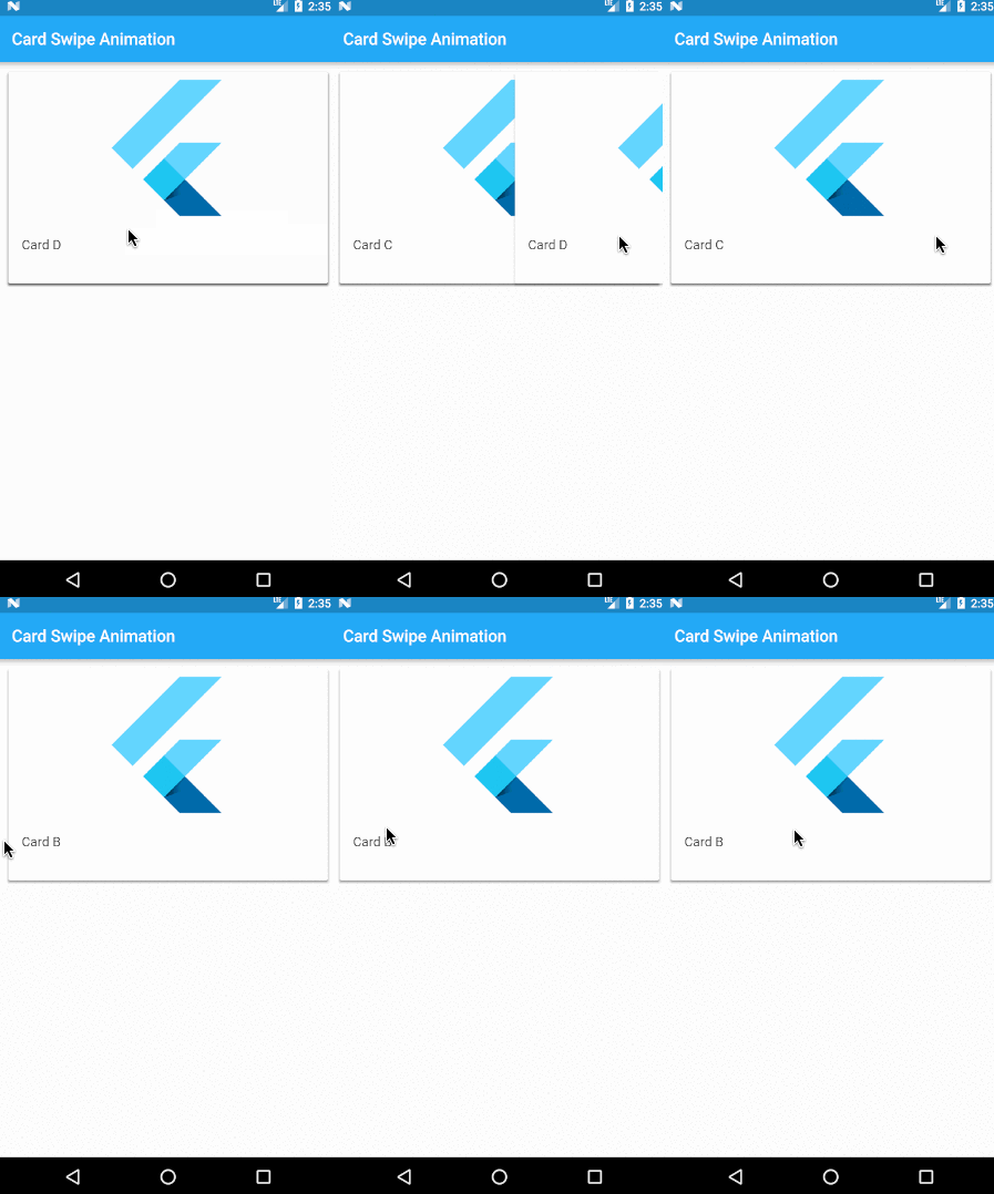
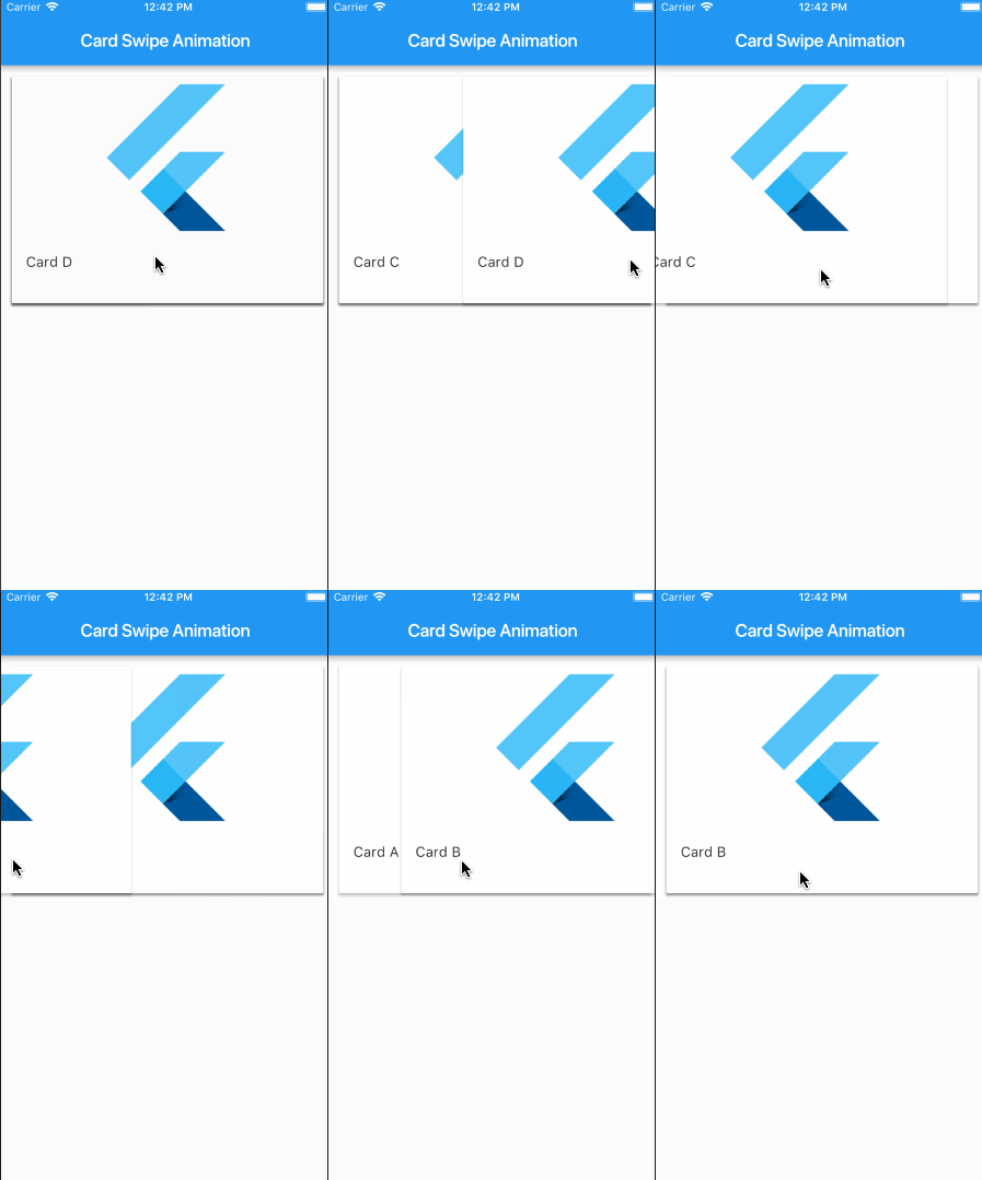
In React Native, you either use PanResponder or third-party libraries for swipe animation. In Flutter, we can achieve this animation by using the Dismissible widget and nest the child widgets.
child: new Dismissible(
  key: key,
  onDismissed: (DismissDirection dir) {
    cards.removeLast();
  },
  child: new Container(
    ...
  ),
),
Preview
| Android | iOS |
|---|---|
 |
 |
Note: Here is the working code.
CheatSheet
| React Native Component | Flutter Widget | Description |
|---|---|---|
| Button | Raised Button | A basic button that should render nicely on any platform. |
| onPress [required] | The callback that is called when the button is tapped or otherwise activated. | |
| Child (A Text widget is used) | Text to display inside the button | |
| Button | Flat Button | A basic material design button |
| onPress [required] | A callback that is called when the button is tapped or otherwise activated. | |
| Child (A Text widget is used) | Text to display inside the button | |
| ScrollView | ListView | A scrollable list of widgets arranged linearly. |
| children | ( <Widget> []) List of child widgets to display. | |
| controller | [ Scroll Controller ] An object that can be used to control the position to which this scroll view is scrolled. | |
| itemExtent | [ double ] If non-null, forces the children to have the given extent in the scroll direction. | |
| scroll Direction | [ Axis ] The axis along which the scroll view scrolls. | |
| FlatList | ListView. builder() | Constructor for linear array of widgets that are created on demand. |
| itemBuilder [required] | [ Indexed Widget Builder] helps in building the children on demand. This callback will be called only with indices greater than or equal to zero and less than itemCount. | |
| itemCount | [ int ] It improves the ability of the ListView to estimate the maximum scroll extent. | |
| Image | Image | A widget that displays an image. |
| image [required] | The image to display. | |
| Image. asset | Several constructors are provided for the various ways that an image can be specified. | |
| width, height, color, alignment | Style and Layout for the Image | |
| fit | Inscribing the image into the space allocated during layout. | |
| Modal | ModalRoute | A route that blocks interaction with previous routes. |
| animation | The animation that drives the route’s transition and the previous route’s forward transition. | |
| Activity Indicator | Circular Progress Indicator | A widget that shows progress along a circle. |
| strokeWidth | The width of the line used to draw the circle. | |
| backgroundColor | The progress indicator’s background color. The current theme’s ThemeData. backgroundColor by default. | |
| Activity Indicator | Linear Progress Indicator | A widget that shows progress along a circle. |
| value | the value of this progress indicator | |
| Refresh Control | Refresh Indicator | A widget that supports the Material “swipe to refresh” idiom. |
| color | The progress indicator’s foreground color. | |
| onRefresh | A function that’s called when the user has dragged the refresh indicator far enough to demonstrate that they want the app to refresh. | |
| View | Container | Surrounds child widget. |
| View | Column | displays its children in a vertical array |
| View | Row | displays its children in a horizontal array |
| View | Center | centers its child within itself. |
| View | Padding | insets its child by the given padding. |
| padding [required] | [ EdgeInsets ] amount of space by which to inset the child. | |
| Touchable Opacity | Gesture Detector | detects gestures |
| onTap | callback when tap occurs | |
| onDoubleTap | callback when tap occurs | |
| Text Input | Text Input | interface to the system’s text input control |
| controller | [ Text Editing Controller ] to access and modify text. | |
| Text | Text | A run of text with a single style. |
| data | [ String ] The text to display. | |
| textDirection | [ Text Align ] How the text should be aligned horizontally. | |
| Switch | Switch | A material design switch. |
| value [required] | [ boolean ] Whether this switch is on or off | |
| onChanged [required] | [ callback ] Called when the user toggles the switch on or off | |
| Slider | Slider | Used to select from a range of values. |
| value [required] | [ double ] current value of slider | |
| onChanged [required] | Called when the user selects a new value for the slider |