Basic Widgets
Widgets you absolutely need to know before building your first Flutter app.
See more widgets in the Flutter widget catalog.
-
Container
A convenience widget that combines common painting, positioning, and sizing widgets.
-

RaisedButton
A Material Design raised button. A raised button consists of a rectangular piece of material that hovers over the interface.
-
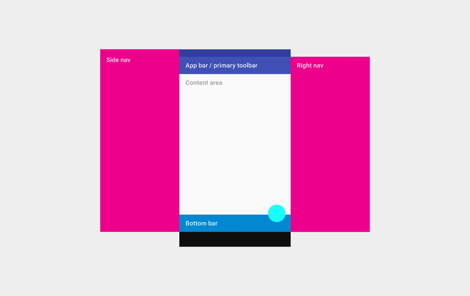
Scaffold
Implements the basic Material Design visual layout structure. This class provides APIs for showing drawers, snack bars, and bottom sheets.
-
Appbar
A Material Design app bar. An app bar consists of a toolbar and potentially other widgets, such as a TabBar and a FlexibleSpaceBar.
-

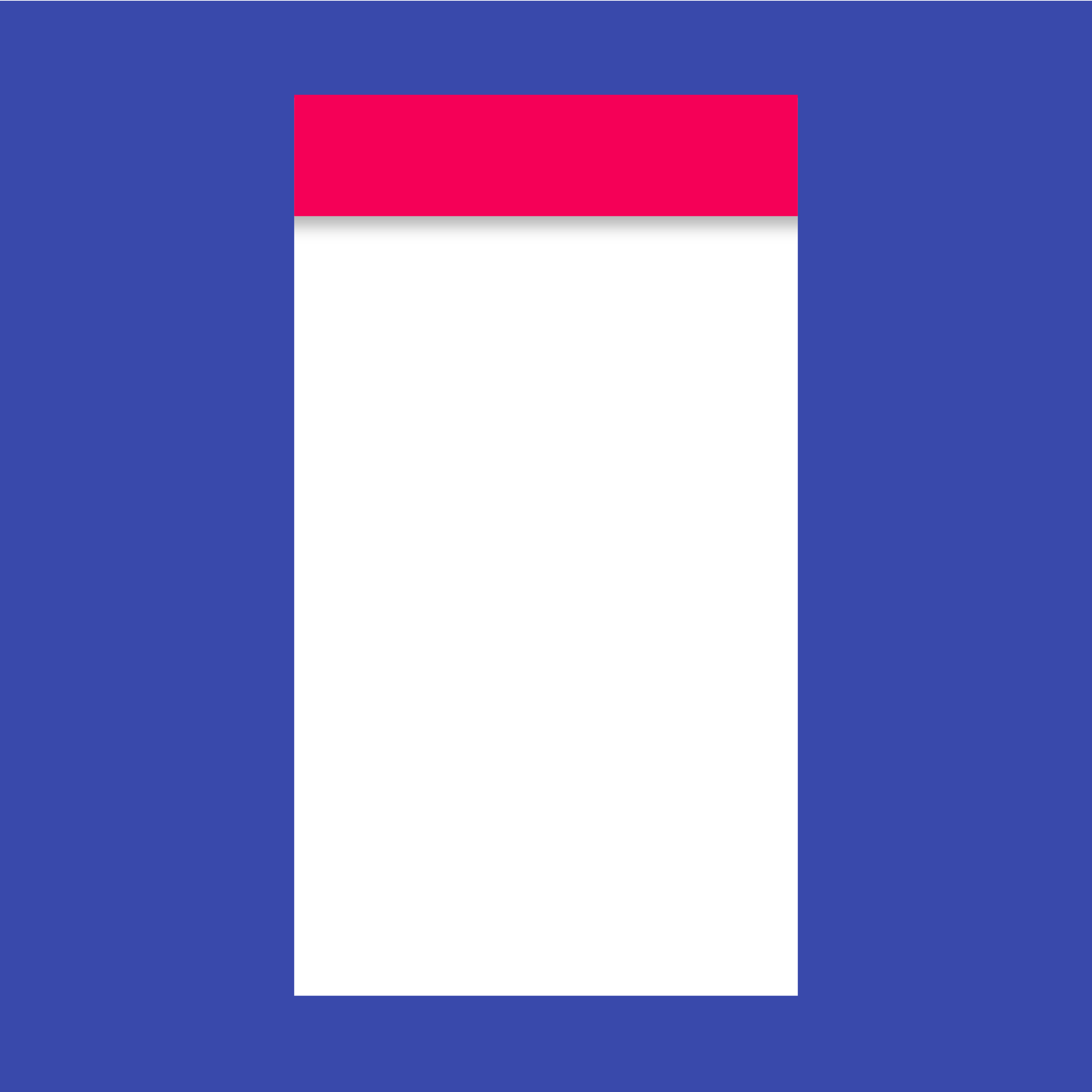
Placeholder
A widget that draws a box that represents where other widgets will one day be added.
See more widgets in the Flutter widget catalog.